Ever felt like you were staring at a financial chart, trying to make sense of a foreign language? You're not alone. For many traders, especially when they're just starting out, all those lines and bars can feel overwhelming. But what if there was a way to translate that chaos into a clear story?
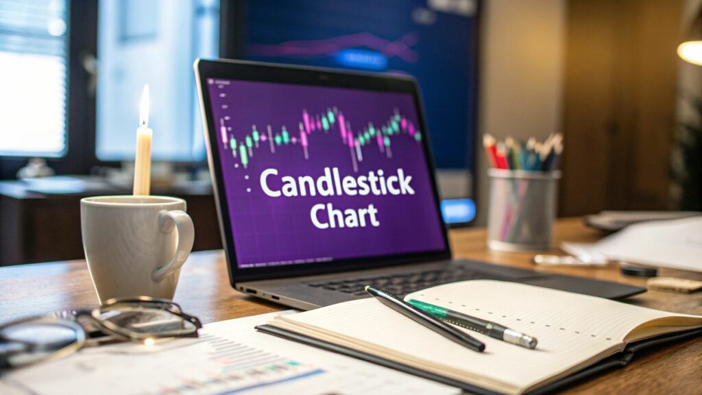
That's exactly what a candlestick chart does. Think of it as your personal market interpreter. It turns complex price data into a simple, visual narrative, making it far more powerful than a basic line graph.
Decoding The Language Of The Market
Unlike a simple line chart that just connects closing prices, each "candle" packs a ton of information into one small shape. It tells you the full story of what happened in a specific timeframe—whether that's one minute, one hour, or one day.
This allows you to get a feel for the market's mood in a single glance. You can see the ongoing battle between buyers and sellers, spot shifts in momentum, and even get clues about where the price might be headed next.
The Four Essential Data Points
At the heart of every candlestick are four key pieces of information. Getting a grip on these is the first real step to reading charts like a pro.
- Open: The price at the very start of the trading period.
- High: The absolute highest price the asset hit during that time.
- Low: The absolute lowest price the asset fell to.
- Close: The final price when the period ended.
This simple structure gives you an immediate picture of the constant tug-of-war between the bulls (buyers) and the bears (sellers). A quick look tells you who won that round, giving you an instant read on market sentiment.
To dig deeper into this powerful tool, checking out a guide on how to understand candlestick charts can really sharpen your skills.
Here's a quick breakdown of what each part of a candle tells you.
A Quick Guide to Candlestick Components
| Component | What It Represents | Market Implication |
|---|---|---|
| Open | The starting price for the period. | Sets the baseline for the session's trading activity. |
| Close | The final price at the end of the period. | Shows who won the battle: buyers (if close > open) or sellers (if close < open). |
| High | The peak price reached. | Represents the highest point of buying pressure or bullish sentiment. |
| Low | The lowest price reached. | Represents the strongest point of selling pressure or bearish sentiment. |
This table neatly sums up how much information is packed into such a simple shape.
By turning raw price action into a visual story, candlestick charts provide a much richer narrative of market dynamics. This is foundational knowledge for anyone looking to learn crypto trading, as mastering these charts is a core skill for interpreting market psychology and making smarter decisions. You can get started on that journey right here: https://www.vtrader.io/news/how-to-learn-crypto-trading/
Understanding the Anatomy of a Candlestick
To really get what a candlestick chart is telling you, you have to break down its individual parts. Think of each candle as a miniature story of a trading session. It has two main characters: the thick part, called the body, and the thin lines sticking out from the top and bottom, known as wicks or shadows.
The body is the heart of the story. It shows you the tug-of-war between the opening and closing price for that period.
This simple visual is one of the most powerful features of these charts. In an instant, you know whether buyers were in control (bullish) or sellers dominated (bearish) during that session.
Decoding the Candlestick Body
The body of a candle gives you two critical pieces of information at a glance: market direction and strength. Its color and size tell the whole tale.
- Color Tells the Direction: A green (or white) body means the closing price was higher than where it started. That's a classic bullish signal—buyers were pushing the price up. On the flip side, a red (or black) body means the close was lower than the open, a clear bearish sign that sellers were in charge.
- Size Shows the Strength: The length of the body reveals how much conviction was behind the move. A long green body shows strong, aggressive buying. A long red one screams decisive selling pressure. Short bodies? They often signal a stalemate, indecision, or a weak push from either camp.
Getting these basics down is essential, as they’re the building blocks for more complex patterns. For example, the power struggle between buyers and sellers is the core concept behind patterns like the bearish flag vs a bullish flag.
Interpreting the Wicks or Shadows
While the body tells you where the price started and finished its journey, the wicks tell you about the detours it took along the way. These thin lines stretch to the highest and lowest prices hit during the session, painting a picture of volatility and shifts in sentiment.
A long upper wick shows that buyers tried to run the price up but ran out of steam. Sellers wrestled back control and pushed the price down before the session closed. This can be a huge warning sign of a potential reversal near a resistance level.
By contrast, a long lower wick tells the opposite story. It shows sellers attempted to dump the price, but buyers jumped in with force, driving it back up. This suggests strong support is lurking and buyers are ready to defend lower prices.
The length and position of these wicks provide vital context. They pinpoint the exact moments where momentum died and one side lost the battle, giving you clues about hidden support and resistance that a simple line chart could never show you.
From Japanese Rice Markets to Modern Trading
It might surprise you, but candlestick charts weren't cooked up in a Wall Street lab. Their story starts centuries ago, far from any computer screen, in the lively rice exchanges of 17th-century Japan. A brilliant merchant there pioneered a visual language for the market, all based on one timeless truth.
He figured out that prices don't just move because of supply and demand—they're powerfully swayed by the emotions of traders. This simple but profound insight gave him a massive advantage.
The Father of Candlestick Charting
The credit for this incredible tool goes to Munehisa Homma, a legendary Japanese rice merchant from the 18th century. Homma developed a way to visually track not just price changes, but the psychological currents driving them. He knew that fear and greed were just as important as the numbers, a concept that became the bedrock of modern technical analysis.
This bit of history is crucial. It shows that candlestick analysis has always been about one thing: getting a read on human behavior in financial markets.
Candlesticks were created to give traders a quick, visual snapshot of market psychology. Each candle tells the story of the battle between buyers (bulls) and sellers (bears) over a set period.
Timeless Principles for Modern Markets
Homma’s original principles were so effective that they formed the foundation of the candlestick charting we use today. He was one of the first to document patterns that showed when market sentiment was about to flip, which let him anticipate price moves with uncanny accuracy.
These core ideas are just as powerful in today's crypto markets as they were in the rice exchanges of feudal Japan. The technology is different, but human psychology hasn't changed a bit.
The very same patterns of fear, greed, and hesitation that Homma spotted centuries ago play out on crypto charts every single second. Understanding these historical roots helps you see that you’re not just looking at lines on a screen—you’re looking at the collective mind of the market. This foundational knowledge is essential when building your own crypto trading strategies.
How Candlestick Charts Conquered the West
For centuries, candlestick charting was one of Japan's best-kept secrets. While rice traders were using this powerful tool to read market psychology, Western traders were still relying on simpler methods like the bar chart, completely unaware of the richer story the candles could tell.
Early Western finance pioneers, including Charles Dow, actually came across Japanese charting methods, but the ideas just didn't stick. The visual language was too foreign, and the technology to easily create and share these charts simply wasn't there yet. The whole concept was seen as a niche curiosity and faded into the background for decades.
The Game Changer Arrives
The real turning point came in the late 20th century, thanks to the relentless work of one analyst: Steve Nison. He made it his mission to translate these centuries-old techniques for a modern, Western audience, bridging a cultural and informational gap that had stood for over a hundred years.
In 1991, candlestick charts exploded onto the US trading scene with the publication of Nison's book, Japanese Candlestick Charting Techniques. He didn't just translate old concepts; he developed new patterns and refined the methods for today's markets. You can read more about this historical shift from the Shogunate to Wall St on VerifiedInvesting.
"Each candlestick is a simple, yet powerful tool to understand what's happening in the market." – Steve Nison
This book kicked off a massive shift in technical analysis. Traders quickly saw how much depth they'd been missing. Being able to see the battle between buyers and sellers so clearly gave them an immediate edge over old-school charts.
The final piece of the puzzle was the rise of personal computers and digital trading platforms in the 1990s. All of a sudden, any trader could pull up and analyze candlestick charts with a click. This tech boom cemented candlesticks as the new global standard—a universal language spoken by traders from Tokyo to New York.
Reading the Story of Basic Candlestick Patterns
A single candle gives you a snapshot, but the real magic happens when candles band together to form patterns. Think of these patterns as short stories, each one hinting at a potential plot twist in the market's direction.
Learning to read them means you can often spot major shifts before they happen, giving you a serious edge. We’ll focus on the foundational patterns that every trader should know—the essential vocabulary for decoding market sentiment.
It’s amazing to think that this tool traveled from ancient Japanese rice markets to our modern trading screens. This infographic traces the key moments when candlestick charts were finally introduced to the West.
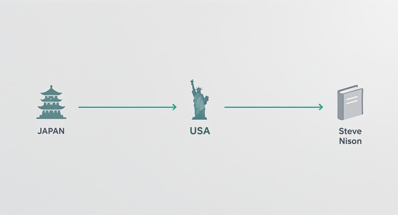
As you can see, this powerful analytical method was a well-kept secret for centuries. It wasn't until Steve Nison's work that it finally became accessible to traders around the world.
Bullish Reversal Patterns
Bullish reversal patterns are your clues that a downtrend might be running out of steam. They often pop up at the bottom of a slump, signaling that selling pressure is fading and buyers are starting to take control. Spotting one can be an early warning that the tide is about to turn.
Two of the most common bullish patterns are the Hammer and the Bullish Engulfing.
- The Hammer: This pattern looks exactly like its name suggests. It has a small body at the top with a long lower wick that’s at least twice the size of the body. This tells you that sellers tried to hammer the price down, but buyers came roaring back, pushing the price all the way back up to close near its open. It’s a powerful sign of buyer resilience.
- The Bullish Engulfing: This is a two-candle pattern. It kicks off with a bearish red candle, immediately followed by a larger bullish green candle that completely "engulfs" the body of the one before it. This pattern shows a sudden and dramatic shift in momentum, where buyers have overwhelmingly overpowered the sellers.
These are just the starting point. Other formations, like the various Doji candles, signal pure indecision in the market, which can also come right before a big move. You can learn more in our detailed guide on what is a Doji candlestick.
Bearish Reversal Patterns
On the flip side, bearish reversal patterns tend to appear at the peak of an uptrend. They serve as a warning that the buying frenzy is losing steam and sellers are starting to gain the upper hand.
Recognizing these can help you lock in profits or even identify potential shorting opportunities. The Shooting Star and Bearish Engulfing are the mirror images of their bullish cousins.
- The Shooting Star: This candle has a small body at the bottom and a long upper wick. It shows that buyers tried to push the price to new highs, but sellers stepped in and slammed it back down to close near the open. It’s a clear signal that the market is rejecting higher prices.
- The Bearish Engulfing: This two-candle pattern starts with a bullish green candle, followed by a much larger bearish red candle that completely swallows the body of the first one. This is a strong signal that sellers have taken command, wiping out the previous period’s gains and suggesting a potential top is in.
Understanding these basic patterns is like learning the alphabet of technical analysis. Each formation tells a story about the psychology of the market, revealing the constant battle between fear and greed that drives price action.
Why Candlesticks Are a Crypto Trader's Best Friend
While candlestick charts are a staple in just about every financial market, they feel tailor-made for the high-speed, volatile world of cryptocurrency. The unique nature of the crypto market makes these charts less of a "nice-to-have" and more of an essential tool for any serious trader.
For starters, traditional stock markets have opening and closing bells. The crypto market never sleeps. It runs 24/7/365, pumping out a continuous, uninterrupted stream of price data.
This constant flow is perfect for candlestick analysis. It gives you a clean, gap-free picture of market action across any timeframe you choose, from minutes to months.
Reading the Emotional Rollercoaster
It's no secret that cryptocurrency markets are fueled by pure emotion. Fear, greed, and hype can trigger massive price swings in the blink of an eye, and candlestick charts were specifically designed to visualize this raw human psychology. A long green candle shows intense, confident buying, while a sharp, plunging red one screams panic selling.
By translating raw price data into a visual story of market sentiment, candlesticks offer a direct window into the collective mindset of traders. This is a huge advantage in a market where a single tweet can spark a bull run or a flash crash.
Getting a handle on this sentiment is absolutely crucial for managing your risk. To protect your capital from crypto's notorious volatility, it’s vital to learn about tools like the stop loss and take profit order.
Versatility Across All Timeframes
Another major perk is just how adaptable candlesticks are. It doesn't matter if you're a scalper jumping in and out of trades or a long-term HODLer—these charts bring clarity to any strategy.
- For Day Traders: You can zoom into the one-minute or five-minute charts to spot short-term patterns and ride intraday waves. It’s like watching momentum build or fade in real-time.
- For Swing Traders: The four-hour or daily charts are your sweet spot. They help identify medium-term trends and reversal points, perfect for positions you plan to hold for a few days or weeks.
- For Long-Term Investors: Looking at the weekly and monthly charts cuts through all the daily noise. This reveals the bigger picture—the true health of an asset and its position in major market cycles.
This power to analyze market psychology across any timeframe makes mastering candlestick charts a non-negotiable skill for anyone looking to navigate the crypto world successfully.
Common Questions About Candlestick Charts
Even after you get the hang of the basics, a few questions tend to pop up for new traders. Let's tackle them head-on to clear up any confusion and get you reading charts with confidence.
What Is the Most Accurate Candlestick Pattern
This is the million-dollar question, but the truth is, accuracy always depends on the current market. That said, many experienced traders put a lot of weight on the Bullish Engulfing and Bearish Engulfing patterns.
Why? Because they show a sudden, powerful shift in who's in control—buyers or sellers. It’s a very clear signal that the previous trend might be over. But remember, no single pattern is a magic bullet. Real accuracy comes from seeing a pattern, then looking for other clues to confirm it before you make a move.
Can Candlestick Patterns Be Used in All Markets
Yep. You can spot candlestick patterns on any chart you can pull up, whether it's crypto, stocks, forex, or commodities. They work everywhere because they're simply a visual representation of human psychology—the endless tug-of-war between bulls and bears.
Of course, reliability can change a bit depending on how volatile a market is or the specific asset you're trading. This is why backtesting your strategies on a particular asset is always a smart move.
Do Professional Traders Actually Use Candlesticks
Absolutely. For a huge number of pros, candlesticks are the foundation of their technical analysis. They give an instant read on market sentiment, which is critical for figuring out the best moments to enter or exit a trade and manage risk.
But here’s the key: professionals rarely use candlestick patterns by themselves. They combine them with other tools like moving averages, volume indicators, and support/resistance levels to build a much stronger, high-probability trading strategy.
This layered approach helps them cut through the market noise and adds a ton of confidence to every decision. It turns a simple chart into a powerful tool for reading the market's next move.
Ready to put your knowledge into action on a platform built for traders? Join vTrader today and experience zero-fee trading on Bitcoin, Ethereum, and over 30 other cryptocurrencies. Get the advanced tools you need to analyze charts and trade smarter. Start trading with vTrader and claim your $10 sign-up bonus.

Steve Gregory is a lawyer in the United States who specializes in licensing for cryptocurrency companies and products. Steve began his career as an attorney in 2015 but made the switch to working in cryptocurrency full time shortly after joining the original team at Gemini Trust Company, an early cryptocurrency exchange based in New York City. Steve then joined CEX.io and was able to launch their regulated US-based cryptocurrency. Steve then went on to become the CEO at currency.com when he ran for four years and was able to lead currency.com to being fully acquired in 2025.