When you dive into crypto, you'll hear two main philosophies for figuring out what to buy and when: fundamental analysis and technical analysis.
Technical analysis is all about reading the charts. Instead of digging into a project's whitepaper or team (that's fundamental analysis), you're looking at historical price action and volume to predict what might happen next. The core idea is simple but powerful: all the important information is already baked into the price you see on the screen.
Decoding the Language of Crypto Markets
Think of a technical analyst as a weather forecaster for the crypto markets. A meteorologist doesn't need to understand every single molecule in the atmosphere to predict a storm. They look at patterns—cloud formations, wind direction, barometric pressure—to see what’s coming.
It's the same deal here. A crypto trader using technical analysis studies price charts and indicators. These tools are the language of the market, translating the constant battle between buyers and sellers into something visual. It all comes down to the belief that human emotions, especially fear and greed, create patterns that repeat themselves over time.
The Guiding Principles of Technical Analysis
At its heart, technical analysis for cryptocurrency is a numbers game, driven by statistics and visual patterns. This whole discipline rests on three core beliefs that every chartist lives by.
Below is a quick breakdown of these foundational ideas. They're the assumptions that allow traders to interpret what the market is "thinking" just by looking at the data.
Core Principles of Crypto Technical Analysis
| Principle | What It Means for Crypto Traders |
|---|---|
| The Market Discounts Everything | You don't need to chase every news headline or rumor. All known information, good and bad, is already reflected in an asset's current price. The chart tells the whole story. |
| Prices Move in Trends | Prices aren't just random squiggles. They move in identifiable trends—either up, down, or sideways—and tend to stay in that trend until a clear force pushes them in a new direction. |
| History Tends to Repeat Itself | Human psychology doesn't change much. Because markets are driven by people, the same patterns of fear and excitement tend to show up again and again, creating chart patterns you can learn to recognize. |
Once you get a feel for these principles, your entire perspective shifts. You stop asking why a price is moving and start focusing on how it's moving—and where it might be headed.
This approach gives you a solid framework for making decisions. It helps you spot potential entry points, figure out where to place stop-losses to protect yourself, and set realistic profit targets.
It's a skill that brings a sense of order to the wild swings of the crypto market. If you want to build a strong foundation, digging into educational resources like those in the vTrader Academy can make a huge difference.
Next up, we'll get into the practical tools you’ll be using every day, starting with the most important one of all: the price chart.
How to Read Crypto Price Charts

Think of a price chart as the battlefield where the war between buyers and sellers plays out in real-time. It’s where the story of supply and demand gets written, and for anyone serious about technical analysis for cryptocurrency, learning to read this story is job number one.
While you might occasionally see simple line or bar charts, the undisputed king among traders is the candlestick chart. Each little "candle" is a powerhouse of information, telling you exactly what happened to the price over a specific timeframe—whether that’s a minute, an hour, or a full day.
The Anatomy of a Candlestick
To get started, you need to understand what makes up a single candlestick. It’s a snapshot of the ongoing tug-of-war between the bulls (buyers) and the bears (sellers), and every part of it tells a piece of that story.
- The Body: This is the thick, rectangular part. It shows you the distance between where the price opened and where it closed for that period. If the body is green, the price closed higher than it opened (a win for the bulls). If it’s red, the price closed lower (a win for the bears).
- The Wicks: These are the thin lines sticking out from the top and bottom, sometimes called "shadows." They show the absolute highest and lowest prices the asset hit during that timeframe. A long wick on top means sellers smacked the price down from its peak, while a long wick on the bottom shows buyers jumped in to rescue it from its lows.
A long green body with tiny wicks? That’s pure, unadulterated buying pressure. A long red body with barely-there wicks tells you the sellers were firmly in control.
Identifying the Three Primary Market Trends
Once you can read a single candlestick, it's time to zoom out. You'll start to see how they form bigger patterns, or what we call trends. In the crypto market, things are usually moving in one of three main directions.
- Uptrend: This is when you see a series of "higher highs" and "higher lows." It's like walking up a flight of stairs—each step up is a new peak. This is a clear signal that the buyers are running the show.
- Downtrend: You guessed it—this is the exact opposite. You'll see a pattern of "lower highs" and "lower lows," like walking down a staircase. Here, the sellers have the upper hand.
- Consolidation (Sideways Market): Sometimes, the price just bounces around in a tight range, not really making any bold moves up or down. This is a period of indecision, a stalemate where both sides are catching their breath.
Spotting the dominant trend is everything. It gives you the context for every trade you make, telling you whether you should be hunting for buying opportunities (in an uptrend) or looking to sell (in a downtrend).
The Crucial Concepts of Support and Resistance
As you watch these trends unfold, you'll notice something fascinating: the price often seems to hit an invisible wall or bounce off an invisible floor. These are support and resistance levels, two of the most powerful concepts in a trader's toolkit.
- Support: This is a price level where buyers have historically shown up in force, preventing the price from falling further. Think of it as a price floor. When the price gets down to a support level, buyers often see it as a bargain and start buying, pushing the price back up.
- Resistance: This is the opposite—a price level where sellers tend to take control and stop an uptrend in its tracks. It acts like a price ceiling. As the price approaches resistance, traders often start selling to lock in their profits, which drives the price back down.
These aren't just single, precise lines on a chart; they're more like zones. A cool thing happens when the price smashes through one of these levels, too. A broken resistance level can flip and become the new support, and a broken support can turn into the new resistance.
Learning to identify these key zones is a game-changer. It helps you anticipate where the market might turn, letting you set much smarter entry and exit points for your trades.
Essential Indicators for Your Trading Toolkit
If price charts are the battlefield, then technical indicators are your advanced reconnaissance gear. They crunch the raw numbers on price and volume, turning them into signals you can actually use. Think of them as helping you confirm trends, get a read on market momentum, and spot potential reversals before they blindside you.
You don't need to clutter your screen with dozens of them. In fact, most pros master just a handful of key indicators. Once you get what they measure and how they play off each other, you can build a seriously effective approach to technical analysis for cryptocurrency.
This infographic breaks down Moving Averages, a bread-and-butter indicator for cutting through the noise and seeing the real trend.
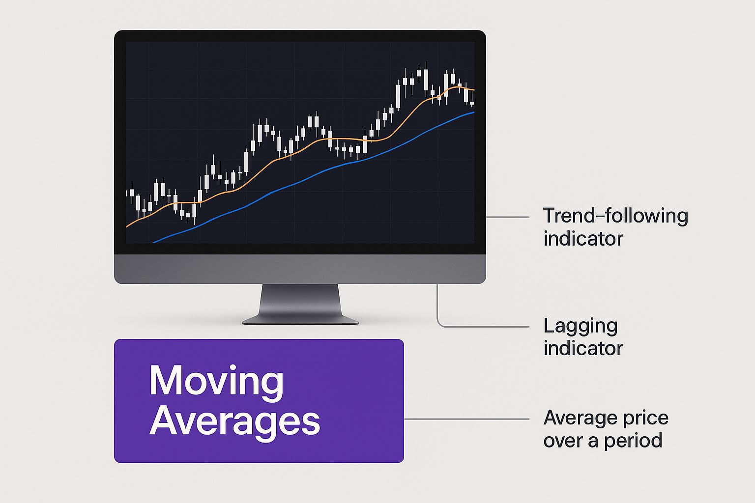
As you can see, these lines smooth out the chaotic day-to-day price action, making it much easier to tell if an asset is in a long-term uptrend or stuck in a downtrend.
Smoothing Price Action with Moving Averages
The first tool just about every trader learns is the Moving Average (MA). Its job is simple but critical: it smooths out the spiky, erratic price swings to show you an asset's average price over a set period. It lets you ignore the short-term static and focus on the bigger picture.
You'll run into two main types all the time:
- Simple Moving Average (SMA): This is the classic version. It just adds up the closing prices over a certain number of days—say, 50—and divides by 50 to get the average.
- Exponential Moving Average (EMA): This one is a bit smarter. It gives more weight to the most recent prices, which makes it react faster to new market information and sudden shifts.
Because the crypto world moves at lightning speed, a lot of traders lean on the EMA. Its quicker reaction time can be a huge edge when you're trying to time your entries and exits in such a volatile space.
Measuring Market Momentum with the RSI
Ever watched a coin go on a monster run, climbing day after day, only to suddenly fall off a cliff? The Relative Strength Index (RSI) is built to give you a heads-up in exactly those situations. It’s a momentum oscillator that tracks the speed and size of price changes on a simple scale from 0 to 100.
The RSI is your go-to for flagging two crucial market conditions:
- Overbought: When the RSI pops above 70, it’s a warning sign that the asset might be getting overheated and is due for a cooldown or price drop. The buying frenzy could be nearing its peak.
- Oversold: If the RSI dips below 30, it suggests the asset might be undervalued and primed for a bounce. It’s a hint that the sellers might be running out of steam.
It's crucial to remember that "overbought" doesn't automatically mean "sell," and "oversold" isn't an instant "buy" signal. Instead, use these readings as warnings to pay closer attention, perhaps looking for confirmation from other patterns or indicators before acting.
Gauging Trend Strength with MACD
The Moving Average Convergence Divergence (MACD) is a fan favorite for a reason—it’s a bit of an all-in-one tool. It’s a trend-following momentum indicator that reveals the relationship between two different Exponential Moving Averages.
The MACD has three parts you’ll see on your chart:
- The MACD Line: This is the heart of the indicator. It’s calculated by subtracting the 26-period EMA from the 12-period EMA.
- The Signal Line: This is just a 9-period EMA of the MACD line itself. Think of it as the trigger line for buy and sell signals.
- The Histogram: This handy visual shows you the distance between the MACD and Signal lines. A growing histogram means momentum is picking up; a shrinking one means it's fading.
A classic buy signal flashes when the MACD line crosses above the Signal line, suggesting the bulls are taking charge. On the flip side, a sell signal happens when the MACD line dips below the Signal line, indicating the bears are gaining control.
Seeing these indicators play out on a live chart is the best way to connect the dots. You can watch them in real-time on our live Ethereum price chart to really solidify your understanding.
Recognizing Key Crypto Chart Patterns
While indicators give you the hard numbers on market momentum, chart patterns tell a story. They reveal the collective psychology of traders—the battles between bulls and bears playing out in real-time. These are recurring shapes that pop up on price charts, giving you a heads-up that a trend might be about to continue its run or reverse course entirely.
Think of it like being a detective at the scene of a crime. You're looking for clues and familiar patterns of behavior that hint at what's likely to happen next. In trading, these chart patterns are your clues to the market's next big move.
Spotting Continuation Patterns
Continuation patterns are essentially the market taking a quick breather. They show up when a strong trend pauses for a moment to consolidate before picking up steam and heading in the same direction again. Learning to spot them is critical—it stops you from mistakenly thinking a solid trend is dead when it's just catching its breath.
Two of the most common continuation patterns in technical analysis for cryptocurrency are:
- Flags: This pattern looks exactly like its name suggests—a small, rectangular channel that slopes against the main trend. In a powerful uptrend, you’ll see the price dip slightly in this "flag" before it breaks out and resumes its climb.
- Pennants: Very similar to flags, pennants also form after a sharp, decisive price move. The key difference is that the consolidation phase creates a small, symmetrical triangle, like a tiny pennant on a flagpole.
These patterns represent moments where the market is digesting a recent surge. The breakout that follows often packs the same punch as the initial move that created the pattern in the first place.
A crucial detail to watch for with both flags and pennants is trading volume. Typically, volume will dry up during the consolidation phase and then spike dramatically on the breakout, confirming the trend is back on.
Identifying Major Reversal Patterns
Unlike the quick pauses of continuation patterns, reversal patterns are the big ones. They signal that a trend is running out of gas and a major shift in direction could be just around the corner. These are the formations that can help you bail on a dying trend or get in early on a new one.
Recognizing these patterns is a game-changing skill for protecting your capital and seizing fresh opportunities. They usually take longer to form than continuation patterns, reflecting a more intense, drawn-out battle between buyers and sellers for control.
Here are three classic reversal patterns you absolutely need to know:
- Head and Shoulders: This is a classic bearish reversal pattern that looks just like it sounds: a central peak (the head) with two smaller peaks on either side (the shoulders). It’s a huge red flag that an uptrend is losing its mojo and a downturn is likely.
- Double Top: Picture this: the price hits a strong resistance level, pulls back, and then tries to smash through that same level again but fails. This creates a distinct "M" shape on the chart and is a powerful bearish signal that buyers are exhausted.
- Double Bottom: The bullish twin of the double top, this pattern forms a "W" shape. It happens when a price hits a support level, bounces, falls back to that same level, and bounces again with conviction. It’s a strong sign that sellers have lost their grip and an uptrend may be starting.
These patterns are visual proof of a power shift in the market. A Head and Shoulders, for instance, shows three failed attempts by bulls to push prices higher, with each push getting weaker. Seeing these take shape on a live chart is the best way to train your eye. You can check out the current Bitcoin price action on vTrader to see how these formations play out across different timeframes. Once you understand the story they tell, you'll be much better at anticipating major market turns.
Putting Your Technical Analysis into Practice
Knowing the theory is one thing, but applying it to a live, breathing chart is where the rubber meets the road. This is where real skill is forged. Let's walk through how these concepts actually come together to build an actionable trading plan, taking a chart from a blank canvas to a complete strategy.
Imagine we're looking at a daily chart for a popular altcoin. The first thing we need to do is get a feel for the market's current mood by pinpointing its key structural points.
Step 1: Laying the Foundation with Support and Resistance
Before you even think about adding a single indicator, you need to map out the battlefield. This means drawing simple horizontal lines at the significant price peaks (resistance) and valleys (support). These are the zones where the balance between buyers and sellers has historically tipped one way or the other.
Next up, we draw our trendlines. By connecting a series of higher lows in an uptrend, or lower highs in a downtrend, we can literally see the market’s momentum. This simple line acts as a dynamic boundary, defining the prevailing trend and giving us a heads-up if the price breaks through it.
Here’s what a vTrader chart can look like with these basic elements in place.
This initial setup immediately gives us context. We can see the key price levels and the dominant trend that we need to respect.
Step 2: Adding Indicators for Confirmation
With our structural lines drawn, it's time to layer in some indicators for deeper insight. We're not looking for indicators to give us magical signals, but to either confirm or challenge what the price action is already hinting at.
A solid starting combo usually includes:
- Moving Averages: Let's add a 20-period EMA and a 50-period EMA. When the faster 20 EMA is cruising above the 50 EMA, it backs up the idea of bullish momentum. A crossover could be an early warning that the trend is about to shift.
- Relative Strength Index (RSI): This is our momentum gauge. An RSI reading above 50 supports a bullish case, while a dip below 50 suggests the bears are in control. We also keep an eye out for overbought (>70) or oversold (<30) readings.
These tools add crucial layers to our analysis. For instance, if the price is nearing a support level just as the RSI is hitting oversold territory, the argument for a potential bounce gets a whole lot stronger.
Step 3: Formulating the Complete Trade Plan
Now for the fun part: putting it all together into a concrete plan. Let's say our technical analysis for cryptocurrency shows a clear uptrend. The price is pulling back to a key support level that also happens to line up with our 50-period EMA. At the same time, the RSI is getting close to oversold, and we've spotted a bullish pennant pattern taking shape.
This confluence of signals—where multiple, independent tools all point to the same conclusion—is what gives traders the confidence to pull the trigger. It’s what turns a wild guess into a calculated probability.
Our trade plan would then look something like this:
- Entry Point: We'll jump into the trade if the price breaks out from the top of that pennant pattern, especially if we see a spike in volume.
- Stop-Loss: A protective stop-loss order gets placed just below the recent swing low and our support line. This is non-negotiable; it defines our maximum acceptable loss.
- Price Target: We’ll set our take-profit target near the next major resistance level we mapped out in the very first step.
This systematic approach turns a chaotic chart into a structured opportunity with clearly defined risk and reward. To see these principles in action, pull up a live chart, like our Litecoin price chart, and see if you can start spotting these elements for yourself.
Taming the Beast: Managing Risk in Crypto’s Wild Markets
Let's get one thing straight: technical analysis isn't a crystal ball. It’s a game of educated guesses and probabilities. In a market known for its face-melting rallies and gut-wrenching drops, the one thing that separates pro traders from the ones who go broke is disciplined risk management. You can be the best chart reader in the world, but it won't matter if one bad trade sends your account to zero.
This is where you marry your charting skills with cold, hard rules to protect your capital. It’s not as thrilling as nailing a perfect trade, but it's the absolute foundation of staying in the game long enough to win. Without it, you’re not trading; you’re gambling.
Your Ultimate Defensive Weapon
Your most powerful tool for survival is the stop-loss order. A stop-loss is simply a pre-set order that automatically sells your crypto if it falls to a certain price. Think of it as the eject button on a fighter jet when a trade goes horribly wrong.
Its purpose isn't to avoid losses—losing trades are just part of the business. Its job is to make sure those losses are small, controlled, and survivable. You decide before you even click "buy" exactly how much pain you’re willing to take, and you stick to that plan religiously.
A stop-loss isn’t just a random number. Tie it directly to your technical analysis. Place it at a logical spot on the chart—just below a key support level, a major moving average, or the bottom of a recent price swing. If the price breaks through that level, your trading idea was probably wrong anyway, and it’s time to get out.
Sizing Your Bets Like a Pro
Just as critical is position sizing. This is all about deciding how much money to risk on any single trade. The goal is to ensure that even a string of losses won’t knock you out of the market. A battle-tested guideline is the 1% rule: never risk more than 1% of your total trading capital on one trade.
If you have a $5,000 account, for instance, you'd cap your potential loss at $50 per trade. This simple discipline keeps you from blowing up your account on a few bad calls, giving you the staying power to let your winning strategy eventually shine through.
And trust me, you need these rules. The crypto market can be brutal. One study of trading strategies on the BTCUSDT pair revealed a mind-boggling average loss of 1625.02% on losing trades under specific conditions. Even a respected Triple EMA strategy on ETHUSDT wasn't immune, showing average losses of 119.07%. If you want to see how extreme losses can happen in crypto and why protecting your downside is non-negotiable, it's worth a look.
Frequently Asked Questions
Diving into technical analysis for cryptocurrency always stirs up a few questions, especially if you're just getting your feet wet. Let's tackle some of the most common ones head-on to give you the clarity you need to trade with confidence.
We'll cut through the noise and get straight to the practical answers that traders need every day. Getting a handle on these concepts is a huge step toward building a trading strategy that actually works.
Is Technical Analysis Reliable in the Crypto Market?
Absolutely. Technical analysis can be incredibly effective in crypto, and here’s why: these markets are driven by human emotion. Speculation, fear, and greed create powerful, repeatable patterns that show up right on the charts.
Of course, a major news story can send prices flying in unpredictable ways. But TA gives you a solid framework for managing that risk with clear entry and exit points. It lets you react to what the price is actually doing instead of trying to guess what the news might do.
What Are the Best Technical Indicators for Beginners?
The biggest mistake new traders make is cluttering their charts with dozens of indicators. You'll get paralyzed by conflicting signals. Instead, start with a simple but powerful trio to build a strong foundation.
- Moving Averages: The 50-day and 200-day EMAs are your best friends for quickly spotting the overall trend. Is the market bullish or bearish? These will tell you at a glance.
- Relative Strength Index (RSI): This is your momentum gauge. It helps you identify when an asset might be "overbought" or "oversold," often hinting that a price reversal is just around the corner.
- Volume: Think of volume as the confirmation. A price breakout on huge volume is a powerful signal. The same move on weak volume? Not so much.
The secret isn't finding one "magic" indicator. It's about using a few simple tools that work together. Combining trend, momentum, and volume gives you a much clearer picture of what the market is telling you.
Should I Use Technical or Fundamental Analysis?
Why choose? The smartest traders use both. They're two different tools that answer two different—but equally important—questions.
Fundamental analysis is all about the big picture. It helps you find quality crypto projects with real, long-term potential. It answers the question, "What should I buy?"
Technical analysis, on the other hand, is about timing. It helps you pinpoint the best moment to get in or out of a trade. It answers the crucial question, "When should I buy or sell?"
Using them together gives you a serious edge. You can invest in strong assets and time your moves to maximize your returns. For more deep dives into common trading questions, be sure to check out the comprehensive vTrader FAQ page.
Ready to stop just learning and start doing? vTrader gives you zero-fee trading, pro-level charting tools, and a secure platform to put your knowledge to the test. Join today and start trading smarter.
https://www.vtrader.io

Steve Gregory is a lawyer in the United States who specializes in licensing for cryptocurrency companies and products. Steve began his career as an attorney in 2015 but made the switch to working in cryptocurrency full time shortly after joining the original team at Gemini Trust Company, an early cryptocurrency exchange based in New York City. Steve then joined CEX.io and was able to launch their regulated US-based cryptocurrency. Steve then went on to become the CEO at currency.com when he ran for four years and was able to lead currency.com to being fully acquired in 2025.