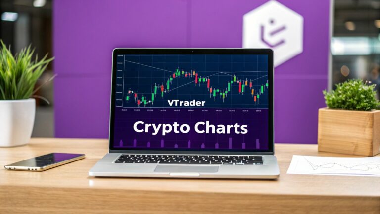
Learning to read crypto charts comes down to three things: price, time, and volume. At its core, a chart is just a visual story of how a cryptocurrency's price moved over a set period. Those colorful little bars you see, called candlesticks, represent the tug-of-war between buyers and sellers. Getting a handle on these basics is your first real step toward making smarter trades.
Your First Look at a Crypto Chart
Diving into crypto trading can feel like trying to read a foreign language, and the chart is your phrasebook. Before you can spot complex patterns or use fancy indicators, you have to know the basic building blocks you’ll find on any platform, including vTrader. Think of it as learning the alphabet before you try to write a sentence.
The heart and soul of nearly every crypto chart are the Japanese candlesticks. These are the red and green bars that make up the main picture. Each one tells you what the price did within a specific timeframe—whether that's a single minute, an hour, or a full day. Simply put, a green candle means the price finished higher than it started, while a red one means it finished lower.
Decoding the Chart's Anatomy
Every chart is built on a few key pieces of data. You need to understand each one on its own before you can see how they all work together to paint the bigger picture.
Here are the main elements you'll run into:
- Price (Y-Axis): This is the vertical axis running up the right side of the chart. It simply shows the price of the crypto asset.
- Timeframe (X-Axis): The horizontal axis along the bottom represents time. You can switch this from minutes to months to zoom in on short-term action or zoom out for long-term trends.
- Trading Volume: These are the bars you usually see at the very bottom. This metric tells you how much of the crypto was actually bought and sold in a given period. High volume can be a powerful sign that a price move has real conviction behind it.
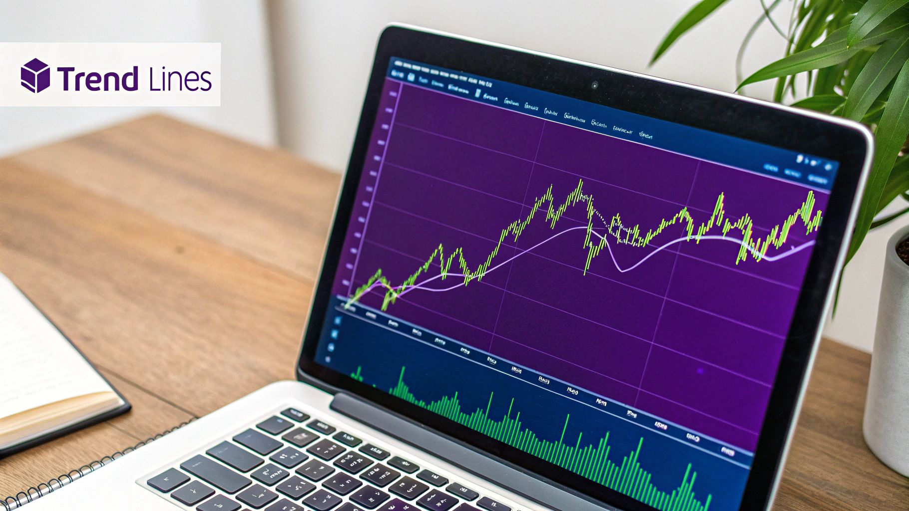
Here’s a look at what a standard crypto chart interface looks like.
This chart shows Bitcoin's price movements using candlesticks, with the corresponding trading volume right below it. Together, they give you a surprisingly complete snapshot of what the market is doing. For anyone looking to go deeper, our vTrader Academy is packed with guides that break all of this down even further.
Key Takeaway: It’s easy to get overwhelmed at first. Ignore all the fancy lines and indicators for now. Just focus on spotting three things: the price, the timeframe, and the volume. Everything else in chart analysis is built on this foundation.
To help you get comfortable, here’s a quick breakdown of the essential components you'll see on almost any chart.
Key Components of a Crypto Chart
| Chart Component | What It Represents | Why It's Important for Beginners |
|---|---|---|
| Price Axis (Y-Axis) | The current and historical price of the asset. | This is your most direct measure of value. |
| Time Axis (X-Axis) | The period over which price is measured (e.g., minutes, days). | Helps you see if a trend is short-lived or long-term. |
| Candlesticks | Price movement within a single time period (open, high, low, close). | The "body language" of the market, showing buying or selling pressure. |
| Volume Bars | The amount of the asset traded during a time period. | Confirms the strength of price moves. Big moves on low volume are suspect. |
Getting familiar with these elements is your starting point. They are the universal language of trading.
Understanding these charts is critical for anyone trying to navigate the crypto markets. This is an industry that was recently valued at around $2.48 billion and is still growing. Charts are how we visualize market psychology, helping traders spot emerging trends and potential turning points. It’s also wise to understand the broader context of the cryptocurrency trading industry before diving into specific strategies.
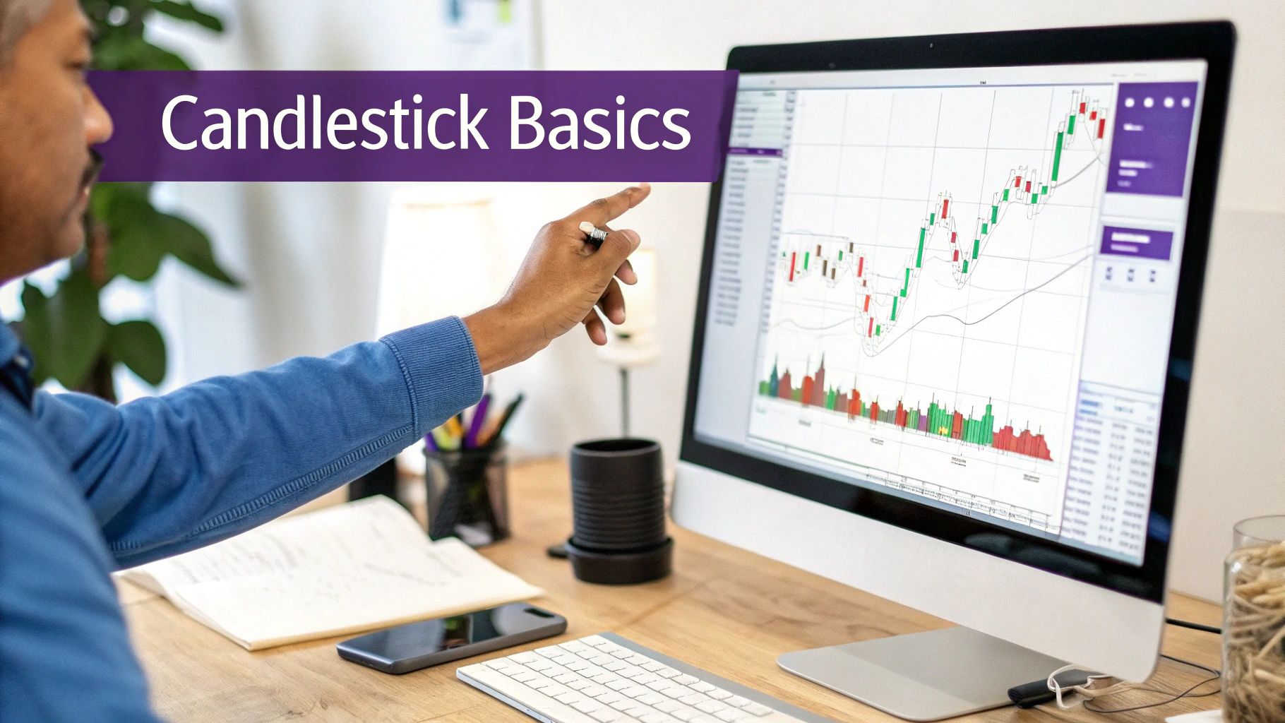
Reading the Story of Japanese Candlesticks
Forget just seeing red and green bars on a chart. Think of each Japanese candlestick as its own chapter in a much larger story. Once you learn how to read them, you’ll get a powerful glimpse into the constant tug-of-war between buyers (bulls) and sellers (bears) over a certain period. The candle's shape and size alone can tell you a lot about market sentiment and where the price might be headed next.
Every single candlestick is made of two key parts: the body and the wicks, which are sometimes called shadows. The body tells you the difference between where the price opened and where it closed. A long, solid body screams strong momentum, while a tiny one hints at indecision or a pause in the action.
The wicks are just as crucial. These thin lines poke out from the top and bottom of the body, marking the highest and lowest prices the asset hit. A long wick at the top means buyers tried to rally but got smacked down by sellers. On the flip side, a long lower wick shows that sellers attempted to dump the price, but buyers jumped in with enough force to push it back up.
Anatomy of a Candlestick
To really get the hang of reading crypto charts, especially if you're a beginner, you have to be able to break down what each candle is telling you. It’s like learning a new visual language, and each candle gives you four critical pieces of information at a glance.
This image shows you exactly what’s inside both a bullish (green, price went up) and bearish (red, price went down) candlestick.
The colored part, or the "real body," gives you the net outcome of the trading session. The wicks, however, reveal the full story of the battle that took place to get there.
Common Single-Candle Clues
Some candle shapes pop up all the time and give pretty reliable hints about what the market is thinking. Spotting these on your vTrader chart can give you a real leg up.
Here are a few essential patterns you should get to know:
- Marubozu: This candle is all body, no wicks. A green Marubozu is a massive bullish signal, showing that buyers were in complete control from the session’s open to its close. A red one means the opposite—sellers dominated entirely, which is very bearish.
- Doji: A Doji candle has a tiny, almost non-existent body. This means the open and close prices were basically the same. It’s a classic sign of indecision, where neither the bulls nor the bears could win. You’ll often see these right before a major trend change.
- Hammer and Shooting Star: Both have small bodies with one long wick. A Hammer has a long lower wick and tends to show up after a price drop, suggesting a potential bottom as buyers fought off lower prices. A Shooting Star has a long upper wick after a price rise, hinting at a potential top as sellers fought off higher prices.
Trader's Tip: The story of a single candlestick becomes much more powerful when you consider its location. A Hammer pattern is far more significant if it forms at a major support level than if it appears randomly in the middle of a price range.
By learning to interpret the stories these individual candles tell, you’re no longer just watching the price go up and down. You’re starting to understand the forces behind the moves. It’s a fundamental skill that opens the door to spotting more complex patterns and making much smarter trading decisions.
Why Trading Volume Matters in Your Analysis
If you've been focused solely on price and candlesticks, you're only getting half the story. Those vertical bars at the bottom of your chart—the trading volume—tell you about the conviction behind every price swing. It's a detail many new traders miss, but it's absolutely crucial.
Think of it like this: a price jump that happens on a huge surge of volume is like a goal scored to a roaring stadium crowd. It's a big deal. A price move on thin volume? That's more like a goal in an empty stadium. It happened, sure, but does anyone really care? The lack of participation is a warning sign.
Learning how to read crypto charts for beginners means treating volume as your go-to reality check. A sharp price increase backed by a massive volume bar suggests there's real buying pressure and the trend has legs. But if the price spikes and the volume bar is just a tiny sliver, you should be skeptical. That’s a classic "fakeout" signal, a move with no genuine support that's ripe for a quick reversal.
Spotting Confirmation and Exhaustion
By watching the interplay between price and volume, you start to get a feel for the market's mood. It helps you see the difference between a trend that's just warming up and one that's about to fizzle out. This is where you can start making smarter, more confident trading decisions.
Here’s what I look for on my own charts:
- Confirming a Trend: When the price is climbing and the volume bars are getting taller, it's a solid confirmation of a bullish trend. It tells me buyers are piling in with enthusiasm.
- Signaling Weakness: If the price keeps pushing to new highs but each push is on less and less volume, that's a major red flag. This shows exhaustion—the trend is running out of gas.
- Spotting a Reversal: A massive, climactic spike in volume after a long uptrend or downtrend often signals the end. This is what traders call "capitulation volume," where the last of the buyers or sellers are finally flushed out, setting the stage for a reversal.
Key Insight: A trend without volume is like a car without fuel—it might roll a little further, but it’s not going to get very far. Always check the volume to see how much power is behind a price move.
Understanding Volume Divergence
One of the most potent signals you'll find is a volume divergence. This happens when price and volume start telling you two completely different things. For instance, an asset might hit a new high, but the volume on that move is noticeably lower than the volume on the previous high.
This divergence is a huge warning. It suggests that even though the price looks strong, fewer people are actually participating. The conviction is gone. This often comes right before a major trend reversal, giving you a chance to protect your profits or hold off on a new trade.
Ultimately, analyzing volume is a core part of managing risk and confirming your entry and exit points. When you place a trade on vTrader, you want to see that volume is on your side. Of course, smart trading also means knowing your costs. You can find a full breakdown in the vTrader commission-free fee structure to make sure you're always prepared.
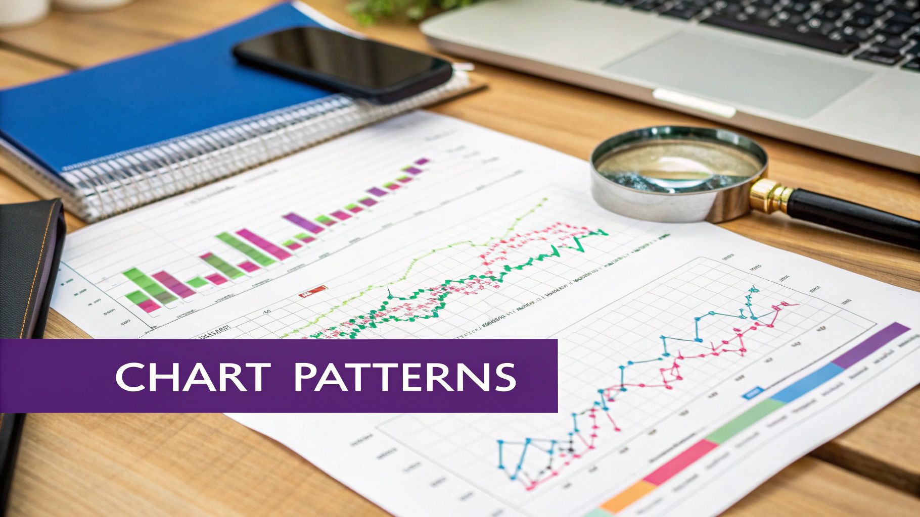
How To Identify Trends With Lines And Channels
Markets rarely move in a straight line. They flow in trends, creating waves of highs and lows. Learning to draw and interpret trendlines is one of the first and most fundamental skills you'll develop in technical analysis. It’s a simple but incredibly powerful way to cut through the noise and see the market's real direction.
Spotting The Trend
The basic idea is simple. For an uptrend, you connect a series of higher lows on the chart. For a downtrend, you connect a series of lower highs.
On the vTrader platform, you can use the drawing tool to connect at least two, but preferably three or more, points to establish a solid trendline. Once drawn, this line acts as a moving support level in an uptrend or a resistance level in a downtrend.
A trendline's real power is revealed when it breaks. A price closing decisively below an established uptrend line is a major bearish signal, suggesting the trend might be over. On the other hand, a clean break above a downtrend line is a bullish sign that buyers are finally gaining the upper hand.
From Lines To Channels
You can take this analysis a step further by creating a price channel. Simply draw a parallel line to your main trendline. If you have an uptrend line connecting the lows, your parallel line will connect the highs.
This channel creates a predictable range where the price is likely to trade. Many traders look to buy near the bottom of the channel and sell or take profits near the top.
Mastering these basic tools is non-negotiable, especially when markets get choppy. During a recent quarter, for example, the total crypto market cap fell by 18.6%, while daily trading volumes plunged by 27.3%. In tough conditions like these, traders lean heavily on patterns like trendlines to manage their risk and find their next move.
Pro Tip: Watch out for trendlines that are too steep. They often don't last long and are prone to breaking. A trendline with a more moderate angle, around 45 degrees, usually points to a healthier, more sustainable trend.
This visual guide shows how you can layer indicators on top of your analysis to sharpen your trading decisions.
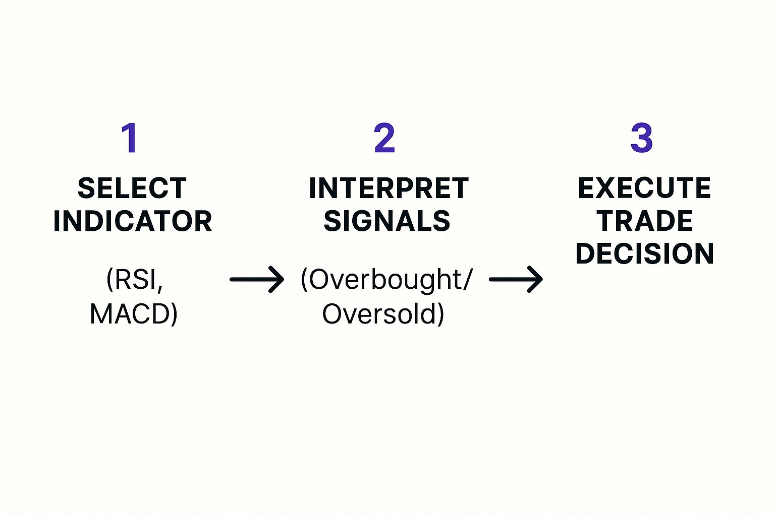
The process boils down to picking an indicator, reading its signals—like overbought or oversold conditions—and then making your move. Combining this with macro-economic data and expert predictions for the next crypto bull run can give your strategy another powerful edge.
These lines and channels provide a solid framework for your trades, helping you stay on the right side of the market's momentum. As you gain more experience, you’ll see how the tools we provide at vTrader are designed to make this kind of analysis second nature. You can learn more about vTrader and our commitment to traders.
Using Key Indicators for Deeper Insight
Alright, once you've got a handle on candlesticks, volume, and basic trendlines, you're ready to add some real firepower to your analysis: technical indicators. These are just mathematical tools that crunch price and volume data behind the scenes. Think of them as special lenses that help you spot market dynamics that are invisible to the naked eye.
The vTrader platform has hundreds of indicators you can play with, but don't get overwhelmed. For now, let's focus on the two workhorses of technical analysis: Moving Averages (MAs) and the Relative Strength Index (RSI). Getting comfortable with these two will make a world of difference in how you interpret crypto charts.
Smoothing Price with Moving Averages
A Moving Average (MA) is one of the most essential trend-following indicators out there. It cuts through the day-to-day noise of price swings by calculating an average price over a set period. This smoothing effect gives you a much cleaner look at the real underlying trend.
You’ll see it as a simple, flowing line layered on top of your candlesticks. When the price stays consistently above that MA line, it’s a good sign you’re in an uptrend. If it’s trading below the line, you’re likely in a downtrend. It’s that simple.
A popular trick is to use two MAs—one short-term (like the 50-day) and one long-term (like the 200-day). When the short-term MA crosses above the long-term one, traders call it a "golden cross," and it’s often seen as a major bullish signal.
Pro Tip: Moving Averages often serve as dynamic support and resistance. In a solid uptrend, you’ll frequently see the price dip to the MA line, almost as if testing it, before bouncing off and climbing higher.
Learning this skill is more important than ever. With the global cryptocurrency market generating an estimated $56.7 billion in revenue and showing 87.13% growth in a recent year, having a strategic edge is crucial. For more on market trends, you can check out insights on socialcapitalmarkets.net.
Gauging Market Strength with RSI
So, MAs help you see the trend. The next question is, how strong is that trend? That's where the Relative Strength Index (RSI) comes in. The RSI is what’s known as an oscillator, meaning it moves back and forth within a set range—in this case, from 0 to 100. It's built to measure the speed and magnitude of price changes.
Primarily, you'll use it to spot two critical conditions: overbought and oversold.
- Overbought (RSI above 70): This is a heads-up that an asset has been rallying hard and fast. It might be getting a bit overheated and could be due for a pullback.
- Oversold (RSI below 30): This suggests the opposite—the asset has been sold off heavily and might be undervalued, potentially setting up for a rebound.
To help you get started, here’s a quick reference for these two fundamental indicators.
Essential Indicators for Crypto Beginners
| Indicator | What It Measures | Key Signal for Beginners |
|---|---|---|
| Moving Average (MA) | The average price over a specific time period, smoothing out volatility. | Look for the price staying consistently above the MA for an uptrend or below for a downtrend. |
| Relative Strength Index (RSI) | The speed and change of price movements, measuring momentum. | An RSI reading above 70 suggests overbought conditions (potential pullback), while below 30 suggests oversold (potential bounce). |
The real magic happens when you combine these tools. Imagine a crypto's price bounces perfectly off its 50-day MA right as the RSI is climbing out of oversold territory (e.g., moving up from 25). Now you have two different signals pointing to the same conclusion: a potential buying opportunity. This kind of confirmation is the bedrock of a solid trading plan.
While trading is often about seizing these short-term opportunities, many also build wealth with long-term holds. If you're interested in earning rewards on your assets, you can learn more about passive income through crypto staking right on our platform.
Common Questions About Reading Crypto Charts
When you first dive into crypto charts, it’s completely normal to have a ton of questions. In fact, asking questions is how you build the confidence to read the market effectively. Let's tackle some of the most common ones that trip up new traders.
Which Timeframe Is Best for a Beginner?
I always tell beginners to start with the bigger picture. Stick to longer timeframes like the daily (1D) or 4-hour (4H) charts. Why? Because they move slower and do a much better job of filtering out the market "noise" you see on the hectic 1-minute or 5-minute charts.
These longer-term charts give you a clearer view of the real trend. It’s about making strategic moves based on solid patterns, not just reacting to every little price flicker. Once you get a feel for analyzing daily and 4-hour charts, then you can start zooming in to shorter timeframes to fine-tune your entry and exit points.
How Do I Know if a Support or Resistance Level Is Strong?
A strong support or resistance level is more than just a single price point where the market turned around once. You need to look for a confluence of factors to really trust it.
First off, how many times has the price hit that level and bounced? The more rejections, the more significant the level becomes in the minds of other traders. But here’s the real confirmation: look at the volume. A reversal off a key level accompanied by high trading volume is a massive tell. It signals that a large number of traders are actively defending that price.
Key Insight: The most powerful levels are often those that have flipped their role. When a stubborn resistance level breaks and then becomes a solid support floor, that's a huge sign of a shift in market psychology.
Can I Rely on Chart Analysis Alone for Trading?
Technical analysis is an incredibly powerful tool, but it's not a crystal ball. Relying on it exclusively is a rookie mistake. Charts give you a fantastic read on market psychology and historical price action, but they don't exist in a vacuum.
It's always smarter to blend it with fundamental analysis—that means understanding the actual project, its technology, the team behind it, and what’s happening in the news. A major regulatory announcement or a surprise partnership can blow even the most perfect chart pattern out of the water.
The best approach? Use your chart analysis to time your trades, but let your fundamental research give you the long-term conviction to hold your positions.
Digging into these concepts often sparks even more questions, and getting clear answers is key. For more detailed explanations, the vTrader FAQ page is a great resource to continue your learning.
Ready to put your new knowledge into practice on a platform designed for clarity and power? Join vTrader today to access advanced charting tools, real-time data, and a commission-free trading environment. Sign up now and start building your skills with a $10 bonus. https://www.vtrader.io

Steve Gregory is a lawyer in the United States who specializes in licensing for cryptocurrency companies and products. Steve began his career as an attorney in 2015 but made the switch to working in cryptocurrency full time shortly after joining the original team at Gemini Trust Company, an early cryptocurrency exchange based in New York City. Steve then joined CEX.io and was able to launch their regulated US-based cryptocurrency. Steve then went on to become the CEO at currency.com when he ran for four years and was able to lead currency.com to being fully acquired in 2025.