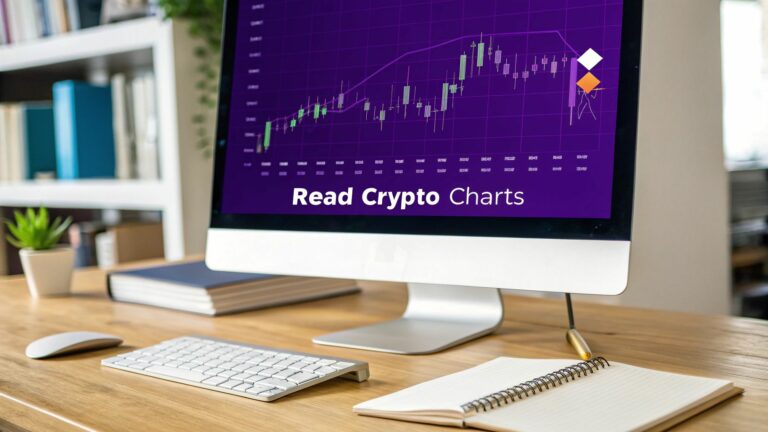
Reading a cryptocurrency chart is all about making sense of price movements to get a feel for where the market might head next. The go-to tool for this is the candlestick chart. It’s a powerful visual that packs the open, high, low, and close prices for a set period into a simple format, telling a rich story of the battle between buyers and sellers. Getting the hang of this is your first real step toward turning a chaotic screen of data into something you can actually use.
Decoding Your First Crypto Chart
Staring at a crypto chart for the first time can feel like you’re trying to crack some ancient code. You've got flashing numbers, lines going every which way, and a bunch of colorful bars. It’s a lot to take in.
But don't get intimidated. At its heart, a chart is just a story about an asset's price over time. It’s your map for navigating the wild swings of the crypto markets.
You’ll immediately notice two axes. The Y-axis (vertical) tracks the price, while the X-axis (horizontal) represents time. You can adjust this timeframe from a single minute to an entire month, depending on whether you're day trading or in it for the long haul.
The Anatomy of a Candlestick
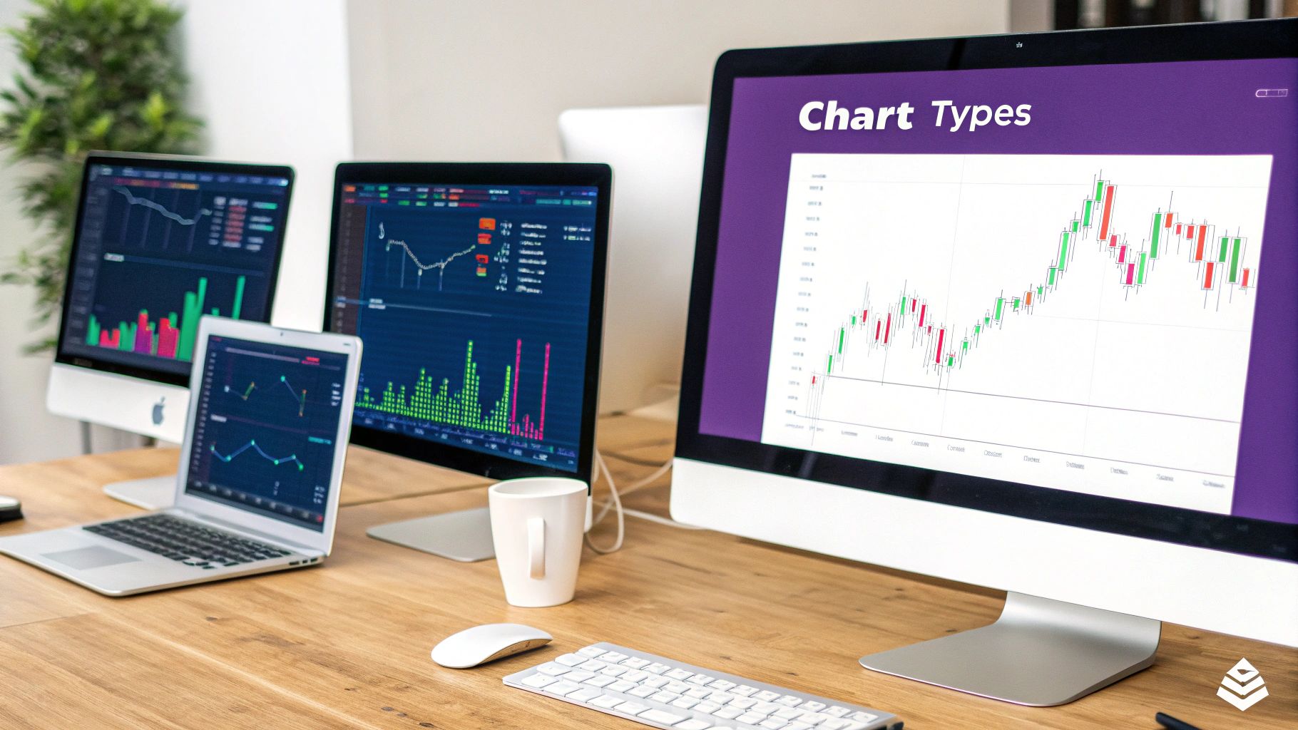
There are a few different chart types out there, but the candlestick chart is the industry standard for a good reason. Each "candle" gives you a surprisingly detailed snapshot of what happened in the market during that specific timeframe.
Every single candle tells you four things:
- Open: The price when the period started.
- High: The absolute highest price hit during that period.
- Low: The lowest point the price touched.
- Close: The final price right as the period ended.
The thick part of the candle is called the body—it shows you the range between the opening and closing price. Those thin lines sticking out the top and bottom? Those are the wicks (or shadows), and they show the full journey from the period's high to its low.
A green (or bullish) candle pops up when the price closed higher than it opened, showing that buyers were in control. A red (or bearish) candle appears when the close was lower than the open, which means sellers dominated.
Putting It All Together
Since crypto markets never sleep, running 24/7, these candlestick patterns give you a constant stream of information. The trading volume is immense—Bitcoin alone often sees over $25 billion traded in a single day—which makes understanding these patterns absolutely critical for catching momentum shifts and potential reversals.
Learning to read the story these candles tell is how you start managing risk in such a fast-moving game.
As you get comfortable with the basics, it helps to understand the bigger picture of how to analyze market trends. This knowledge helps you place what you’re seeing on the chart into a much broader strategic context.
If you’re curious about the platforms that bring all this data to life, you can learn more about our mission at vTrader and how we're committed to giving traders the best tools for the job at https://www.vtrader.io/en-us/About. Building this foundational knowledge is the first major step toward navigating charts like a pro.
Mastering Candlestick Patterns and Market Signals
Once you get the hang of a candlestick's basic anatomy, you'll start seeing them as more than just random red and green bars on a screen. Think of them as the market's body language. Every pattern tells a story about the constant tug-of-war between buyers (bulls) and sellers (bears), offering clues about where the price might be heading next.
Learning to read a crypto chart effectively really just means learning this visual language.
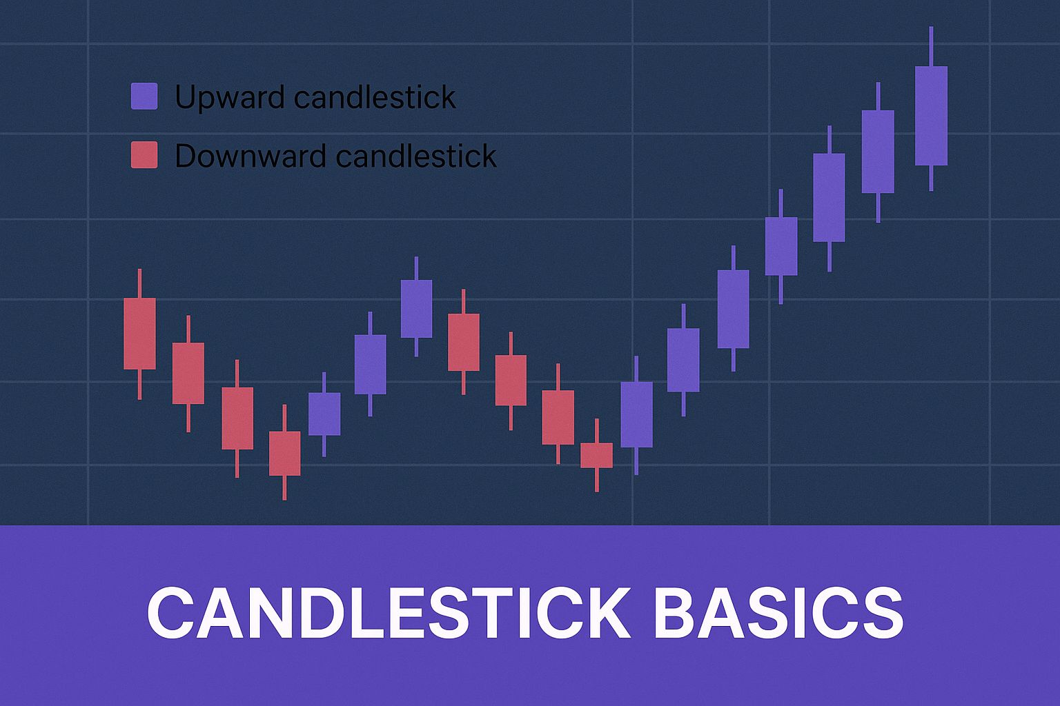
This graphic really nails down the core components of bullish (up) and bearish (down) candles, which is the foundation for spotting the more complex patterns we're about to jump into.
Spotting Bullish Reversal Signals
Bullish patterns are the ones you look for at the bottom of a downtrend. They’re often the first sign that buying pressure is starting to wake up and push back against the sellers. Catching one of these early can feel like getting a heads-up that the trend might be about to flip.
Here are a couple of classic examples I always watch for.
The Hammer Candle
A Hammer is a single-candle pattern that looks exactly like its name suggests. It has a short body at the top, almost no upper wick, and a long lower wick that looks like a handle.
- What it looks like: Sellers tried to hammer the price down—that’s your long lower wick. But just when it looked bleak, buyers stormed back in and pushed the price all the way back up to close near where it opened.
- What it means: This is a powerful rejection of lower prices. It’s a classic signal that the bulls are testing the waters and might be gearing up for a rally.
The Bullish Engulfing Pattern
This is a potent two-candle pattern. It happens when a small red candle is immediately followed by a larger green candle that completely "engulfs" the body of the one before it.
- What it means: The sellers had their moment, but the buyers came back with a vengeance. The second candle didn't just reverse the previous period's losses; it blew past them. This sudden shift in momentum is often a very strong indicator that a new uptrend is kicking off.
Pro Tip: A bullish pattern is far more convincing when it forms near a known support level and is backed by a spike in trading volume. Think of it as confirmation—the market is putting its money where its mouth is.
Identifying Bearish Reversal Patterns
Of course, what goes up can also come down. Bearish patterns are your warning signs. They tend to pop up at the top of an uptrend, suggesting that sellers are starting to gain the upper hand and a price drop could be around the corner.
The Shooting Star
The Shooting Star is basically the evil twin of the Hammer. It has a small body at the bottom, a long upper wick, and very little (if any) lower wick.
- What it looks like: Buyers got ambitious and pushed the price way up, creating that long wick. But before the session closed, sellers slammed it right back down to close near the open.
- What it means: This is a textbook rejection of higher prices. The market tried to rally but got smacked down, showing that the bears are digging in their heels.
The Bearish Engulfing Pattern
This is the bearish version of the pattern we just discussed. A small green candle gets completely dwarfed by a massive red candle right after it.
- What it means: This signals a dramatic shift in sentiment. The bulls had a small victory, but then the sellers came in with overwhelming force. It often suggests the uptrend has run out of steam and a reversal is on the table.
To help you quickly identify these patterns and more, here's a handy reference table. I suggest keeping it bookmarked until recognizing them becomes second nature.
Common Candlestick Patterns and Their Meanings
| Pattern Name | Type | What It Looks Like | Potential Signal |
|---|---|---|---|
| Hammer | Bullish Reversal | Short body at the top, long lower wick. | Sellers tried to push the price down but buyers regained control. Potential bottom is forming. |
| Bullish Engulfing | Bullish Reversal | A large green candle completely covers the previous small red candle. | Strong shift in momentum from sellers to buyers. A new uptrend may be starting. |
| Morning Star | Bullish Reversal | A three-candle pattern: a long red, a small-bodied candle, and a long green. | Signals the end of a downtrend as buyers start to take over from a point of indecision. |
| Shooting Star | Bearish Reversal | Short body at the bottom, long upper wick. | Buyers tried to push the price up but sellers forced it back down. Potential top is forming. |
| Bearish Engulfing | Bearish Reversal | A large red candle completely covers the previous small green candle. | Strong shift in momentum from buyers to sellers. An uptrend may be ending. |
| Evening Star | Bearish Reversal | A three-candle pattern: a long green, a small-bodied candle, and a long red. | Signals the end of an uptrend as sellers begin to dominate after a period of uncertainty. |
This table covers the big ones, but remember that context is everything. Always look at the surrounding price action and other indicators to confirm what a pattern might be telling you.
The Signal of Indecision: The Doji
Sometimes, the chart isn’t screaming "buy" or "sell." It's just shrugging. That's when you'll see a Doji candle. A Doji forms when the opening and closing prices are almost identical, leaving you with a candle that has virtually no body—it looks more like a cross or a plus sign.
A Doji represents a perfect stalemate. Neither the bulls nor the bears could gain any ground. While it’s not a reversal signal by itself, seeing a Doji after a strong, sustained trend can be a major red flag that momentum is sputtering out.
Learning these patterns takes practice, but it's a skill that pays dividends. For anyone serious about diving deeper, the vTrader Academy is packed with structured lessons and practical insights to help you get up to speed.
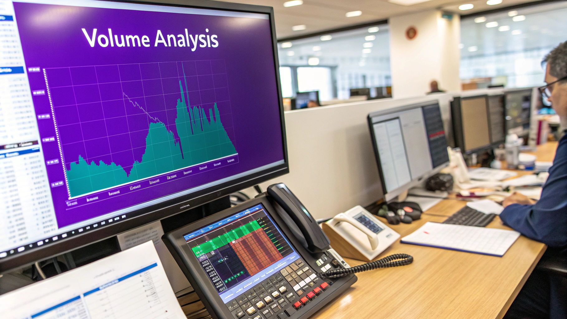
Understanding the Critical Role of Volume
If candlestick patterns are the market’s body language, then volume is its voice. It’s the raw emotion behind a price move, telling you just how much conviction traders are putting behind their buys and sells.
Ignoring those volume bars at the bottom of your chart is like watching a movie on mute. You see the action, but you miss the entire story.
Put simply, volume is the total amount of a crypto traded over a specific period. Each volume bar syncs up with the candlestick directly above it. A towering green volume bar under a big green candle? That’s a powerful statement—a sign of widespread buying pressure confirming that upward push.
On the flip side, a tiny volume bar during a big price jump suggests very few people were involved. That makes the move feel weak, almost fragile.
Reading the Story of Volume and Price
The real insight comes when you start pairing price action with volume. Their relationship can either give a trend the green light or wave a massive red flag that something is off.
Here’s how I think about it:
- Rising Price + Rising Volume: This is the bull run scenario you want to see. It signals growing interest and heavy buying, suggesting the rally has the fuel to keep going.
- Rising Price + Falling Volume: This is a classic warning sign. Sure, the price is climbing, but fewer and fewer people are participating. The trend is losing steam and could be headed for a reversal.
The same logic works for downtrends. A price collapse on huge volume points to intense selling pressure—a strongly bearish signal. But if the price is trickling down on low volume, it suggests sellers are running out of gas, and the downtrend might be weakening.
Key Takeaway: Volume validates price. A significant price move without significant volume is always suspect. Always look for volume to confirm what the price action is telling you.
How Volume Helps You Avoid Traps
One of the best uses for volume analysis is spotting fakeouts. A fakeout, or false breakout, happens when the price pokes above a key resistance level, luring in buyers, only to crash back down and trap them.
Imagine a coin finally breaks above a major resistance line. If that breakout happens on weak volume, be careful. It suggests there isn't enough real buying power to hold those new, higher prices. Many experienced traders will wait for a breakout to be confirmed by a surge in volume before they even think about entering a trade.
This one simple check can save you from jumping into moves that have zero real momentum. Getting caught in these traps can be costly, especially when you factor in trading fees. Understanding how crypto trading fees are structured helps you appreciate why avoiding these bad trades is so crucial to your bottom line.
The Power of Volume Divergence
Sometimes, price and volume tell you two completely different stories. We call this divergence, and it can be one of the earliest signs that a trend is about to reverse.
- Bearish Divergence: The price keeps grinding out new highs, but the volume on each new peak gets lower and lower. This tells you that despite the rising price, the enthusiasm is drying up. The rally is running on fumes.
- Bullish Divergence: The price is carving out new lows, but the selling volume is shrinking with each drop. This is a sign of seller exhaustion. The selling pressure is fading, which could set the stage for a market bottom and a reversal higher.
History is littered with examples. Look at Bitcoin's epic run from around $800 in late 2016 to nearly $20,000 a year later. The charts from that period are marked by massive volume spikes on up-days, confirming the buying frenzy. The subsequent crash to near $3,100 was just the opposite, with huge volume spikes on sell-offs, highlighting the panic.
Learning to read these patterns is essential for timing your moves in a market that now boasts a cap well over $2 trillion. You can explore more cryptocurrency market data to see these cycles for yourself. By keeping a close eye on those volume bars, you’re adding an indispensable tool to your arsenal.
Using Key Indicators to Confirm Your Analysis
Candlestick patterns and volume give you a solid read on market psychology, but technical indicators are what provide the data-driven backup you need to trade with conviction. Think of them as a co-pilot for your analysis. These are just mathematical calculations based on price and volume that get plotted directly onto your chart.
While there are hundreds to choose from, getting lost in the noise is a rookie mistake. Instead, let's zero in on three of the most powerful and widely used indicators. Mastering these will give you a robust framework for chart analysis without overcomplicating things.
Riding the Trend with Moving Averages
Moving Averages (MAs) are arguably the simplest yet most effective tools for gauging the overall trend direction at a glance. They work by smoothing out the chaotic day-to-day price action into a single, flowing line that shows the average price over a set period.
You'll see two MAs pop up time and time again:
- The 50-day MA: This is your go-to for the short-to-medium-term trend.
- The 200-day MA: Widely respected as the definitive line in the sand for the long-term trend.
The logic is simple. When the price is trading above these MAs, the market is generally bullish. When it’s trading below them, sentiment has turned bearish.
But the real insights come when these two lines cross paths. A famous bullish signal, the Golden Cross, flashes when the shorter-term 50-day MA pushes above the longer-term 200-day MA. Traders often see this as the start of a major, long-term bull run.
The opposite is the dreaded Death Cross. This occurs when the 50-day MA falls below the 200-day MA, signaling a potential prolonged downtrend. Both are major events that get the attention of everyone from retail traders to big institutions.
Measuring Momentum with the MACD
Next up is the Moving Average Convergence Divergence, or MACD (pronounced "Mac-Dee"). This is a pure momentum indicator that reveals the relationship between two different moving averages, helping you see if a trend is gaining steam or running out of gas.
The MACD has three parts to watch:
- The MACD Line: The main engine of the indicator.
- The Signal Line: A moving average of the MACD line itself.
- The Histogram: Bars that visualize the distance between the two lines.
The most common signal is a simple crossover. When the MACD line crosses above the Signal line, that’s a bullish signal suggesting upward momentum is kicking in. When it crosses below, it's bearish, indicating momentum is shifting downward. The histogram gives you a quick visual cheat sheet—bars above the zero line mean bullish momentum, while bars below it signal bearish momentum.
Spotting Overbought and Oversold Conditions with the RSI
The Relative Strength Index, or RSI, is another momentum tool, but its primary job is to measure the speed and magnitude of price changes. It oscillates on a scale from 0 to 100, giving you a heads-up when an asset might be "overbought" or "oversold."
Here’s how traders typically read it:
- Overbought: An RSI reading above 70 suggests a coin has been bought up too aggressively and could be due for a cooldown or price correction.
- Oversold: An RSI reading below 30 suggests an asset has been sold off too hard and might be primed for a bounce.
Picture this: an altcoin you’re watching has been on a tear for days, and you're feeling the FOMO. A quick look at the RSI shows it’s screaming high at 85. This doesn’t guarantee a crash, but it’s a massive red flag that you might be buying at the absolute top, right as the early birds are getting ready to cash out.
Important Takeaway: Indicators should never be your only reason for a trade. They work best together. A bullish MACD crossover becomes much more compelling if it happens while the price is holding above the 200-day MA and the RSI is climbing out of oversold territory. The goal is to build a case by finding multiple signals that all point in the same direction. This concept, known as confluence, is what separates high-probability trading from pure gambling.
By combining these three indicators, you create a powerful system of checks and balances. The Moving Averages set the stage by defining the trend, the MACD tells you how strong that trend is, and the RSI warns you when the market is getting too hot or cold. Together, they add a critical layer of objectivity to your chart reading.
How to Draw Support Resistance and Trend Lines
While indicators can pile on layers of data, some of the most potent analysis comes from drawing a few simple lines on your chart. Getting a handle on support, resistance, and trend lines is a practical skill that turns a noisy, chaotic chart into a clear map of potential market turning points.
This hands-on technique is fundamental because it’s built directly on historical price action. It shows you exactly where buyers and sellers have consistently made their stands before.
Identifying and Drawing Support Levels
Think of a support level as a price floor. It's a point where buying interest has historically been strong enough to absorb all the selling pressure, causing a downtrend to slam on the brakes or even reverse. Put simply, it’s an area where demand consistently shows up.
To draw a support line, you just need to spot at least two major lows on your chart.
- Look for clear "swing lows" where the price dropped, then bounced back up.
- Grab the line tool in your charting platform.
- Draw a horizontal line connecting these lows.
Now, it's rare for the price to hit the exact same pixel every time. That’s why it’s better to think of support as a zone rather than a razor-thin line. A price dipping slightly below your line isn’t automatically a failed support; it could just be testing the strength of that demand zone.
Drawing these levels isn't just busywork; it’s a strategic move. A strong support level can be an ideal area to consider entering a long position or placing a protective stop-loss just below it. A clean break of that level is a clear signal that sellers have finally wrestled control away from the buyers.
Pinpointing and Drawing Resistance Levels
If support is the floor, resistance is the ceiling. This is a price level where selling pressure has historically overwhelmed buying interest, stopping a rally in its tracks and often sending it back down. It’s a zone where supply is thick.
Drawing a resistance line follows the same logic as support, just in reverse.
- Find at least two distinct "swing highs" or peaks where the price rallied and then got rejected.
- Use your line tool to connect these peaks with a horizontal line.
When a price creeps up toward a well-established resistance level, traders start getting antsy, anticipating a potential rejection. This makes it a strategic spot to take profits on a long position or even consider a short entry if other signals confirm the bearish momentum. When the price finally smashes through resistance, it's a huge bullish signal, and that old ceiling often becomes the new floor (support).
Visualizing Market Direction with Trend Lines
While support and resistance are horizontal, trend lines are diagonal lines that help you see the market's overall direction and momentum at a glance. They act as dynamic boundaries for price action.
The Uptrend Line
An uptrend is just a series of higher highs and higher lows. To draw an uptrend line, you connect at least two of the major higher lows. This line acts as a moving support level, showing where buyers keep stepping in to push the price higher. As long as the price respects this line, the bullish trend is considered alive and well.
The Downtrend Line
Conversely, a downtrend is a series of lower highs and lower lows. A downtrend line is drawn by connecting at least two of the significant lower highs. This line acts as a dynamic resistance, showing where sellers are consistently maintaining control. A decisive break above this line is often the first real sign that the bears might be losing their grip.
Mastering these manual tools is a core skill for any serious trader. The rise in global crypto adoption means millions of people are looking at these same charts. The number of crypto users surged to over 400 million by mid-2025, with around 60% of them in major markets using technical analysis as part of their strategy. With daily trading volumes for assets like Bitcoin often topping $15 billion, these widely watched levels can become self-fulfilling prophecies. You can discover more about global cryptocurrency user trends on Statista to get a sense of just how many eyes are on these charts.
This hands-on approach to reading a chart is invaluable, whether you're day trading or just looking for smarter long-term entry points. Even passive strategies benefit from this knowledge; our guide on how crypto staking works shows how you can earn rewards, but timing your initial purchase near a solid support level can seriously improve your starting position.
Common Questions About Reading Crypto Charts
It’s completely normal to have questions pop up, even after you think you’ve got the basics down. Mastering crypto charts is a journey, not a destination. Let’s tackle some of the most common questions traders ask, so you can navigate the markets with a bit more clarity.
Getting these fundamentals straight is the key to actually applying what you've learned when real money is on the line.
What Is the Best Timeframe to Use?
There's no magic answer here—the "best" timeframe is entirely dictated by your personal trading style and objectives. What works for a long-term HODLer would be next to useless for a scalper.
- Day Traders: These traders live on the shorter timeframes. Think the 5-minute or 15-minute charts, where they can spot and act on rapid, small-scale price fluctuations.
- Swing Traders: If you're holding positions for a few days or weeks, the 4-hour or daily charts are your bread and butter. They offer a much clearer view of the market's momentum and key structural levels.
- Long-Term Investors: For those playing the long game (months or years), the weekly or monthly charts are essential for identifying major market cycles and ignoring the short-term noise.
A killer technique is to blend multiple timeframes. You might spot a strong uptrend on the daily chart, then drill down to the 1-hour chart to pinpoint a low-risk entry. This is what seasoned traders call multiple timeframe analysis, and it's a game-changer.
How Can I Avoid Fake Signals?
Ah, the dreaded "fakeout" or "whipsaw." It’s a frustrating part of trading in volatile markets like crypto. Your single best defense is confirmation. Never, ever trade based on one isolated signal.
Instead, think of it as building a case for your trade. You see a bullish hammer candle forming right on a major support line? Great start. But don't pull the trigger just yet. Ask yourself:
- Is volume picking up, confirming buying interest?
- Does the RSI show there’s still room to run before the asset is overbought?
- Is the MACD about to flash a bullish crossover?
The more signals that line up, the higher the probability that you're looking at a genuine move. One pro tip that will save you a lot of grief: always wait for the candle to close before making your move. This stops you from getting suckered in by a momentary price spike that quickly reverses.
Should I Rely Only on Technical Analysis?
While technical analysis is an incredibly powerful tool, going all-in on TA alone is a rookie mistake. The crypto market is notoriously sensitive to things that simply don't show up on a chart—at least, not until it’s too late.
A textbook bullish setup can get completely wiped out in minutes by a surprise regulatory crackdown, a major exchange hack, or even a single influential tweet. The best traders I know always combine their chart work with a solid grasp of the bigger picture.
This hybrid approach means using TA to nail your entries and exits while staying plugged into the fundamental factors driving the market—news, project updates, and overall sentiment. This gives you a far more robust and reliable edge.
For more answers to other frequent questions, our extensive crypto trading FAQ page is a great place to dig deeper.
Ready to put your chart reading skills to the test? With vTrader, you can trade Bitcoin, Ethereum, and over 30 other cryptocurrencies with zero commission fees. Sign up today and get a $10 bonus to start building your portfolio on a platform designed for smarter, more profitable trading. Join vTrader now.

Steve Gregory is a lawyer in the United States who specializes in licensing for cryptocurrency companies and products. Steve began his career as an attorney in 2015 but made the switch to working in cryptocurrency full time shortly after joining the original team at Gemini Trust Company, an early cryptocurrency exchange based in New York City. Steve then joined CEX.io and was able to launch their regulated US-based cryptocurrency. Steve then went on to become the CEO at currency.com when he ran for four years and was able to lead currency.com to being fully acquired in 2025.