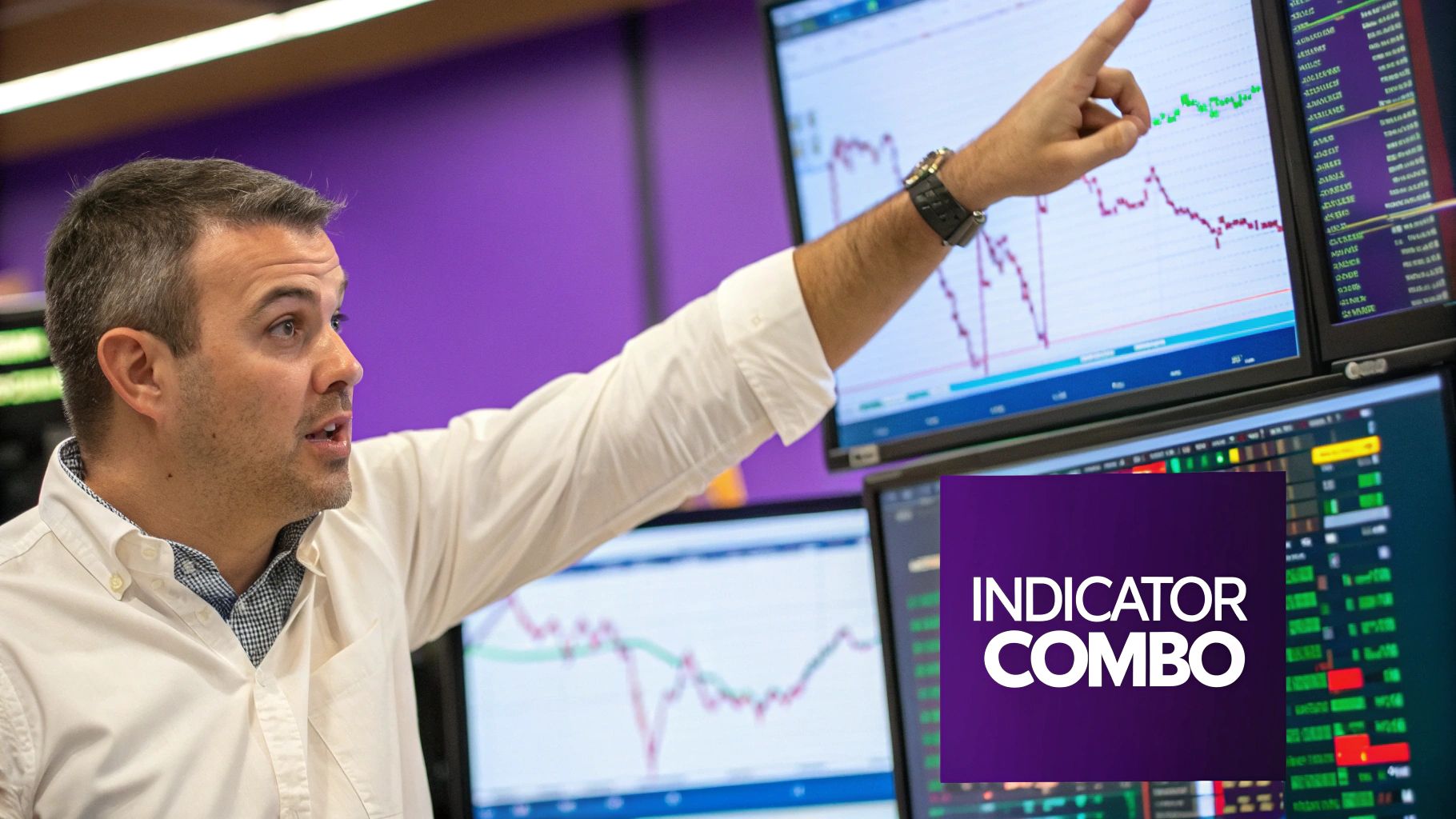
Think of cryptocurrency trading indicators as your co-pilot for navigating the wild swings of the crypto markets. They aren't magic crystal balls, but they do a fantastic job of translating what looks like a chaotic price chart into clear, visual signals that tell you about market trends, momentum, and potential turning points. Honestly, mastering just a few key indicators is way more effective than getting bogged down by dozens.
How to Navigate Crypto Markets with Trading Indicators
This guide is designed to cut through the clutter and get straight to the indicators that seasoned traders rely on every day. We’ll dive into the essential types—trend, momentum, volume, and volatility—to help you shift from making guesses to making sharp, data-backed decisions that can protect your capital and help you spot opportunities others are missing.
The goal isn't to predict the future with 100% accuracy, because nobody can. It's about understanding the probabilities. It's a lot like a weather forecast that uses data like temperature and air pressure to predict rain. Trading indicators use price and volume data to give you a heads-up on where the market might be heading next, bringing a sense of order to an otherwise unpredictable environment.
Why Indicators Are More Important Than Ever
The game has changed. Over the last decade, the explosion of crypto trading platforms and the sheer amount of data available have made indicators more powerful than ever. The market ballooned from fewer than 50 cryptocurrencies in 2013 to over 13,000 by 2025, now trading across more than 600 global exchanges. When you have giants like Binance reporting 170 million users and daily volumes topping $22.5 billion, that incredible liquidity makes indicator-based strategies much more reliable. You can dig deeper into this market growth and how to access crypto data on CoinAPI.
The single biggest mistake I see new traders make is plastering their charts with every indicator under the sun. The real secret is picking a few complementary tools that, when used together, tell a clear, concise story about what the market is doing.
This guide will help you build that exact toolkit. Once you grasp a few core concepts, you can start reading charts with a newfound confidence. At the end of the day, successful trading often boils down to answering three simple questions:
- What's the trend? Is the market heading up, down, or just chopping sideways?
- How strong is the momentum? Is the current price move powerful or running out of steam?
- Is there volume to back it up? Are a lot of traders behind this move, or is it just noise?
These are the fundamental questions our chosen cryptocurrency trading indicators will help you answer. To take your understanding of these core principles even further, be sure to explore the resources at the vTrader Academy.
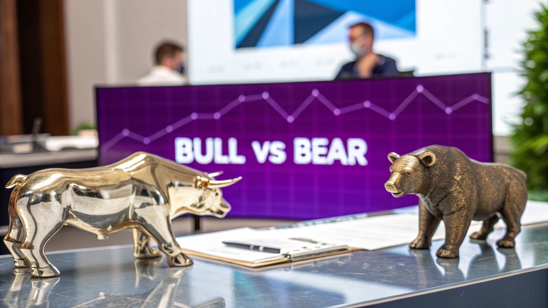
Catching Market Waves with Trend Indicators
If there's one golden rule in crypto trading, it's knowing which way the tide is pulling. Instead of just guessing, seasoned traders rely on trend indicators to see the big picture. Think of them as a way to filter out all the chaotic, minute-by-minute price noise, revealing the real underlying current of the market.
One of the most essential tools in any trader's kit is the Moving Average (MA). It's a simple concept: the indicator calculates the average price of an asset over a set time, then plots it as a single, smooth line on your chart. This makes it instantly easier to see which direction the trend is headed.
The Two Flavors of Moving Averages
You'll find a few different types of MAs out there, but two really dominate the charts: the Simple Moving Average (SMA) and the Exponential Moving Average (EMA).
- Simple Moving Average (SMA): This one is as straightforward as it gets. It just adds up the closing prices over a specific period—say, 20 days—and divides by 20 to get the average. Every day's price has the same importance, giving you a broad, smoothed-out view of the trend.
- Exponential Moving Average (EMA): The EMA is a bit quicker on its feet. While it also averages prices, it gives more weight to the most recent action. This design makes it react much faster to sudden price shifts, which can be a game-changer in the volatile crypto world.
Since the EMA is more sensitive, many short-term traders on platforms like vTrader lean on it to catch trend changes early. On the flip side, long-term investors often prefer the SMA for its smoother line, which helps tune out the minor market chatter.
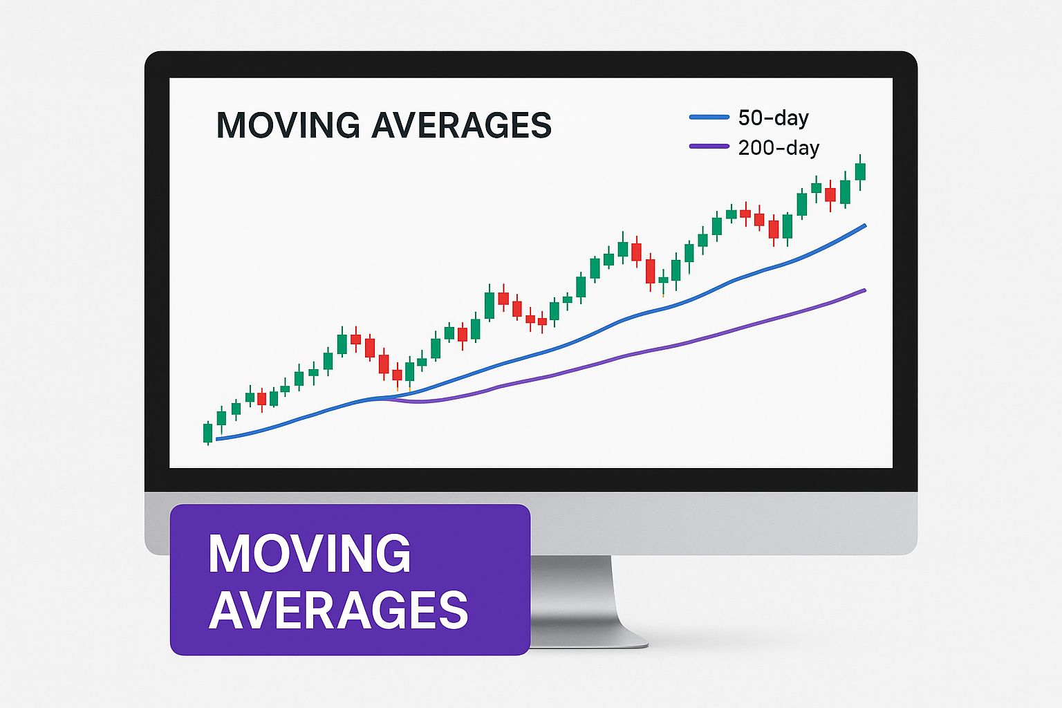
As you can see, both moving averages trace the price action, giving you a clear visual guide to the market's overall direction.
Comparing Key Trend Indicators
To help you decide which tool might fit your strategy, here's a quick comparison of the most common trend indicators. Each one offers a unique perspective on market movements.
| Indicator | What It Measures | Key Signal | Best For |
|---|---|---|---|
| Moving Average (MA) | The average price of an asset over a specific period, smoothing out volatility. | Crossovers (e.g., Golden Cross, Death Cross). | Identifying the primary trend direction (uptrend, downtrend, or sideways). |
| MACD | The relationship between two EMAs, showing both trend direction and momentum. | MACD line crossing the signal line. | Gauging the strength or weakness of a trend and spotting reversals. |
| Parabolic SAR | Potential stop and reversal points, appearing as dots above or below the price. | The dot flipping its position. | Setting trailing stop-losses and timing entries/exits in clear trends. |
| ADX | The strength of a trend, but not its direction. It ranges from 0 to 100. | A reading above 25 indicating a strong trend. | Confirming if a market is trending or ranging before applying a strategy. |
This table isn't exhaustive, but it highlights how different indicators can complement each other, giving you a more complete view of what the market is doing.
Identifying Major Trend Shifts
Moving averages are famous for generating some of the most-watched signals in all of trading: crossovers. This is when a shorter-term MA crosses over a longer-term one, often signaling a major shift in market sentiment is underway.
A Golden Cross is a classic bullish signal. It happens when a short-term MA (like the 50-day) climbs above a long-term MA (like the 200-day), suggesting a potential long-term uptrend is just beginning.
The opposite is the Death Cross, which occurs when the short-term MA dips below the long-term MA. This is a historically bearish signal that can precede major market downturns. These aren't just abstract ideas; they are real, actionable events you can track right on the vTrader platform to sharpen your trading decisions.
Going Deeper with the MACD Indicator
While MAs are fantastic for seeing the trend's direction, the Moving Average Convergence Divergence (MACD) indicator adds another layer of insight: momentum. It doesn't just tell you where the market is going, but also how much force is behind the move.
The MACD is made up of three parts working in sync:
- The MACD Line: This is the heart of the indicator. It's calculated by subtracting the 26-period EMA from the 12-period EMA.
- The Signal Line: This is just a 9-period EMA of the MACD line itself. It serves as a baseline, and when the MACD line crosses it, a buy or sell signal is generated.
- The Histogram: This handy visual shows you the distance between the MACD and Signal lines. When the bars on the histogram grow taller, momentum is picking up. When they start to shrink, the trend might be running out of gas.
By watching how these three elements interact, you can get a feel for whether a trend is gaining steam or losing it—often giving you a valuable head-start before a reversal happens.
Using Oscillators to Measure Market Momentum
While trend indicators show you the market's direction, momentum oscillators tell you how much gas is left in the tank. Think of it like a car speeding up a steep hill. At first, it's gaining speed, but as the incline gets tougher, the engine starts to strain. Even though the car is still moving uphill, it’s slowing down. Oscillators are the tachometer on your dashboard, showing you that engine strain before the car stalls out completely.
For crypto traders, these tools are essential. They help answer the all-important question: is this trend about to fizzle out? By measuring the velocity and change of price movements, oscillators can warn you when a trend might be getting tired and ripe for a reversal.
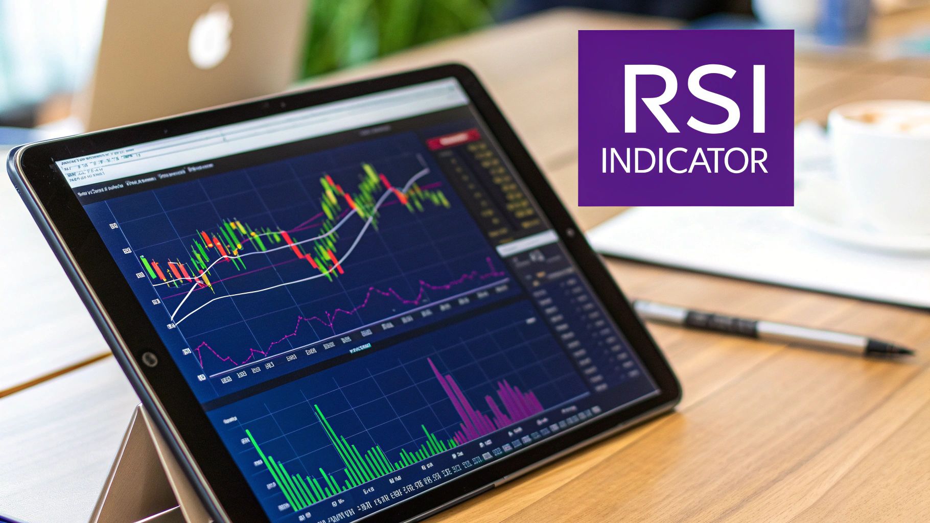
Understanding the Relative Strength Index (RSI)
One of the most popular and reliable momentum oscillators out there is the Relative Strength Index (RSI). Developed way back in 1978 by J. Welles Wilder Jr., it's a simple line that fluctuates between 0 and 100, and its main job is to flag potentially overbought and oversold conditions.
- Overbought (RSI above 70): When the RSI crosses above the 70 line, it's a hint that the asset might be getting a bit too hot and could be due for a cooldown, or a price correction. Buyer enthusiasm might be peaking.
- Oversold (RSI below 30): On the flip side, when the RSI dips below the 30 mark, it signals the asset could be undervalued and poised for a rebound. Sellers may be running out of steam.
But here’s a rookie mistake: selling the second RSI hits 70 or buying the moment it drops to 30. In a rip-roaring bull market, an asset can stay "overbought" for a surprisingly long time. The real magic of the RSI lies in a more subtle signal.
The most powerful signal from the RSI isn't just about overbought or oversold levels; it's about divergence. This is when the indicator's movement disagrees with the price action, often foreshadowing a significant trend reversal before it happens.
This signal, known as divergence, is a go-to for seasoned traders on the vTrader platform.
Spotting Trend Reversals with RSI Divergence
Divergence is what happens when the price chart is telling you one thing, but the RSI is telling you something completely different. It’s a major red flag that the current trend is losing its footing.
Let's say Bitcoin is in a strong uptrend and just printed a new, higher price peak. But when you glance down at the RSI indicator, you notice it has just made a lower peak. That’s a textbook bearish divergence. The price pushed higher, but the momentum behind that push got weaker—a classic sign the rally is losing steam and a downturn could be right around the corner.
Conversely, imagine Bitcoin’s price tumbles to a new low, but the RSI makes a higher low. That's a bullish divergence. It suggests that even though the price dropped, the selling pressure is easing up, and buyers might be getting ready to jump back in. Learning to spot these divergences on your chart is a skill that can give you a serious edge in the market.
Confirming Your Signals with Volume and Volatility
A sharp price spike might catch your eye, but if there’s no real power behind it, that rally can die out just as fast as it started. This is where volume and volatility indicators become your most trusted partners in the trading arena. They help you double-check what you're seeing, confirming that the trends and momentum signals on your chart are the real deal.
Think of it this way: a price trend is telling a story, but the volume is the crowd's reaction. A massive price jump on barely any volume is like a single person clapping in an empty stadium—it’s just not convincing. These indicators are crucial for separating genuine market moves from simple noise, giving you the confidence you need before putting your capital on the line.
Gauging Market Energy with Bollinger Bands
One of the absolute classic tools for measuring volatility is Bollinger Bands. Developed by legendary trader John Bollinger, this indicator uses three lines drawn right over the price chart:
- A middle band, which is just a 20-day simple moving average (SMA).
- An upper band, sitting two standard deviations above the middle band.
- A lower band, positioned two standard deviations below the middle band.
What makes this tool so useful is that the outer bands aren't static. They expand when the market gets wild and contract when things quiet down. This provides an immediate visual read on market volatility.
A powerful signal every trader should watch for is the "Bollinger Band Squeeze." This is when the bands tighten up, signaling a period of very low volatility. A squeeze is often the calm before the storm, and it frequently precedes a massive price breakout in either direction. On vTrader, seasoned traders will often wait for the price to burst out of a squeeze on high volume to confirm that a new, powerful trend is underway.
When the price hits or even goes beyond one of the outer bands, it's not an automatic buy or sell signal. Think of it more as a sign that the price is at a relative extreme. A touch of the upper band suggests the asset is getting expensive, while a tag of the lower band hints that it might be getting cheap.
Following the Money with On-Balance Volume (OBV)
While Bollinger Bands tell you about volatility, the On-Balance Volume (OBV) indicator is all about tracking buying and selling pressure. It's a surprisingly simple yet powerful tool. If a coin’s price closes up for the day, the day's volume is added to a running total. If it closes down, the volume is subtracted. The resulting OBV line gives you a clear picture of whether money is flowing into or out of an asset.
The core idea here is that volume should move in the same direction as the trend.
- Uptrend Confirmation: If the price is carving out higher highs and the OBV line is doing the same, it’s a great sign. It confirms the buying pressure is legit and the uptrend is strong.
- Downtrend Confirmation: The same logic applies on the way down. If both price and OBV are making lower lows, it validates the strength of the sellers.
The real warning sign is a divergence between price and OBV. If you see the price climbing but the OBV line is flat or, even worse, falling, it’s a major red flag. This suggests there's no real conviction behind the rally, and it could be setting up for a reversal. You can stay on top of these kinds of market shifts by keeping tabs on our real-time vTrader crypto news hub.
Understanding how volume and volatility play out in different markets is also key. For example, there was a time when the BTC/TRY (Turkish Lira) pair saw trading volume over $4.75 million with 17% daily volatility. Meanwhile, the BTC/NGN (Nigerian Naira) pair had a much higher volume near $179 million but also much wilder 24% volatility. Grasping these differences is crucial for any global crypto trader, and you can dive deeper into these kinds of figures by checking out crypto market data and statistics on TradingEconomics.
Gaining an Edge with On-Chain Indicators
While technical indicators are great for reading price action and volume, the crypto world offers a secret weapon that traditional markets just don't have: on-chain data. Think of it as getting a look under the hood of the blockchain itself to see what major players like miners and long-term holders are doing. It adds a completely new dimension to your analysis, moving you beyond simple chart patterns.
On-chain indicators take all that raw, public blockchain data and turn it into signals you can actually use. Instead of just seeing what the price is doing, you start to understand why. Are miners feeling the financial squeeze? Are long-term holders finally starting to cash out? These are the kinds of questions on-chain metrics help you answer, giving you a serious information advantage.
Tapping into Miner Psychology with the Puell Multiple
One of the sharpest tools in the on-chain shed is the Puell Multiple. Developed by David Puell, this indicator zeroes in on the financial health of Bitcoin miners—the very people who keep the network secure. It measures their profitability by comparing the value of Bitcoin issued today to the 365-day moving average of that same value. When you get a feel for the Puell Multiple, you can often spot major market tops and bottoms long before the crowd does. You can discover more about crypto market cycle indicators on CoinMarketCap.
Here’s how to read the signals:
- Low Puell Multiple (Green Zone): When the multiple dips into the green zone, it’s a red alert that miner revenue is historically low. This suggests miners are under intense financial stress, a situation sometimes called "miner capitulation." Looking back, these periods have consistently been some of the best buying opportunities in Bitcoin's history.
- High Puell Multiple (Red Zone): On the flip side, a spike into the red zone means miners are making a killing. This usually happens when market euphoria is at its peak and the price is getting overheated, signaling a potential top is near.
A Glimpse into Deeper On-Chain Analysis
The Puell Multiple is just the tip of the iceberg. Other powerful on-chain tools give you different angles on the market’s health. The Net Unrealized Profit/Loss (NUPL), for example, gauges the overall profitability of every coin in the network. It tells you if investors are sitting on huge gains (euphoria) or staring at widespread losses (capitulation).
By combining on-chain data with traditional technicals, you're no longer just trading the chart—you're trading the entire network's economic activity. This provides a much more robust foundation for your decisions.
These deep-level insights, which you can track right on the vTrader platform, are incredibly powerful. They add a fundamental layer to your trading strategy that complements what trend and momentum indicators are showing you. In the same way, understanding long-term wealth generation, like earning passive income, can strengthen your overall approach. Check out our guide on how staking works on vTrader to see what's possible.
Building a Cohesive Indicator Trading Strategy
All the data in the world is useless if you don't have a game plan. Now that we’ve unpacked some of the most powerful crypto trading indicators, it’s time to put them together into a framework you can actually use. One of the most common—and costly—mistakes traders make is trusting a single indicator. That's like navigating with only a compass; you know which way is north, but you have no map to tell you about the cliffs or swamps ahead.
The real magic happens when you get several non-competing indicators to confirm what you're seeing. This creates a layered defense against fakeouts and bad entries. Instead of jumping on one signal, you wait for a consistent story to unfold on your chart, where different tools all point to the same conclusion about the market's direction and strength. This simple discipline can dramatically stack the odds in your favor.
Think of it like assembling a team of specialists for a mission. The trend indicator is your strategist, pointing out the main objective. The volume indicator is your scout on the ground, confirming the enemy's numbers. And the momentum oscillator is your spy, reporting back on their morale. You need all three to make a truly confident decision.
A Practical Trade Example
Let's walk through how this works in a real-world scenario. Say you’re eyeing Bitcoin on the vTrader platform, and you think a new uptrend might be starting. Here’s how you’d use multiple indicators to build a case for your trade:
-
Step 1: Identify the Trend. First, you check for a Moving Average Crossover. You spot the 20-period EMA slicing up through the 50-period EMA—a classic bullish signal that a new uptrend could be taking hold.
-
Step 2: Confirm with Volume. But is there any real money behind this move? You pull up the On-Balance Volume (OBV) indicator. You see the OBV line is also pushing higher, making higher highs right alongside the price. This is your confirmation that significant buying pressure is fueling the rally.
-
Step 3: Check Momentum. Before you rush to place an order, you glance at the RSI to make sure you aren't buying the absolute top of a short-term pump. The RSI is sitting at a healthy 58, showing solid upward momentum but still far from the overbought territory above 70. This tells you there's likely more room for the price to run.
By getting a green light from all three signals, you've built a much stronger, more logical case for entering a long position. This disciplined process helps you avoid the "analysis paralysis" that comes from a cluttered chart and ensures you’re trading with a clear plan. When you factor in your execution, keeping an eye on our competitive fee structure at vTrader helps you maximize your potential returns on well-planned trades like this.
Common Questions About Trading Indicators
As you start using crypto trading indicators, a bunch of questions are bound to pop up. It's completely normal. Getting these fundamentals straight from the get-go is the best way to build a solid trading strategy and sidestep those classic rookie mistakes.
How Many Indicators Should You Use?
One of the biggest traps for new traders is what we call "analysis paralysis"—that feeling of being totally stuck because your chart is drowning in conflicting signals. It's tempting to slap on every new indicator you discover, but trust me, less is more.
A great way to start is with a clean, simple setup of two to three indicators that don't just repeat the same information.
For instance, you could pair:
- A Moving Average to get a feel for the market's main direction.
- An oscillator like the RSI to see if that trend still has gas in the tank.
- A volume tool like OBV to confirm whether the buying or selling pressure is real.
This kind of focused toolkit tells a clear story without throwing a dozen different opinions at you.
The real goal isn't finding some magical, "perfect" combination. It’s about building a small set of tools you know inside and out. Being consistent with a few indicators you truly understand will beat randomly using dozens of them any day.
Can Indicators Predict the Future?
Let's get this straight right now: no indicator can predict the future. Period. Think of them more like weather forecasts for the market. They analyze past price movements to spot patterns and give you a sense of what might happen next. They signal when conditions look good for a trade, but they never, ever offer guarantees.
This is exactly why solid risk management is so crucial. You should always use stop-losses to protect your capital and never put more money on the line than you're prepared to lose. If you have more questions, the detailed vTrader FAQ page is a great resource.

Steve Gregory is a lawyer in the United States who specializes in licensing for cryptocurrency companies and products. Steve began his career as an attorney in 2015 but made the switch to working in cryptocurrency full time shortly after joining the original team at Gemini Trust Company, an early cryptocurrency exchange based in New York City. Steve then joined CEX.io and was able to launch their regulated US-based cryptocurrency. Steve then went on to become the CEO at currency.com when he ran for four years and was able to lead currency.com to being fully acquired in 2025.