This guide is part of the “Intro to Crypto Trading” series.
Crypto charts may look intimidating at first, especially if you did not enjoy math class back in school. But a helpful way to look at charts is to realize they’re just stories being told through numbers. Every candle, every line, every spike in volume is a visual clue that reveals who’s in control of the market at that moment. The buyers or the sellers give you signals through the chart patterns.
Once you learn to read them, you can stop guessing about what’s going on and start trading with the information that the market gives you. Chart analysis is how pro traders use probabilities to reach a desired outcome.
This guide will simplify crypto charting and show you how to read any chart step-by-step, whether you’re HODLing for the long term or making short-term trades.
Table of Contents
Understanding the Structure of a Crypto Chart
A crypto chart might look like a bunch of random boxes (or a squiggly line), but it’s actually made up of just a few simple parts. Understanding these fundamentals will give you the proper framework to interpret the information.
Price Axis (Y-axis) and Time Axis (X-axis)
The Y-axis (movement up/down) represents the price, it shows how much a cryptocurrency is worth at any given moment. The X-axis (from the left to the right) represents time, showing you when that price occurred.
As you move from left to right, you’re moving forward in time, observing how price has evolved and are able to form theories about what it might do in the future. If you look from right to the left of the chart, you are scrolling into the past and can see how price behaved historically.
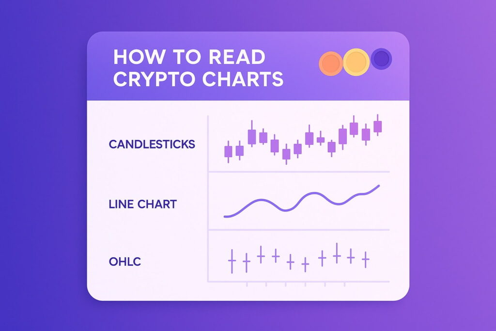
Together, these create the foundation for every form of chart analysis. You also have several chart options like a simple line chart or a more complex candlestick chart which give you slightly different visual clues.
Understanding Timeframes
Each candle or bar on the chart represents a specific timeframe. A timeframe is a section of time where the candlestick or bar (bar chart) reflects all the price action from that period.
- On a 1D (daily) chart, each candle shows one full day of trading.
- On a 4H (4 hour) chart, each candle represents four hours.
- A 1M (1 minute) chart shows the price action that happened within a minute, you get the picture.
Traders use short timeframes (like 1H or 15M) for quick trades and long timeframes (like 1D or 1W) to capture broader trends. The shorter the timeframe, the more noise you’ll see, which can be useful for day trading but distracting for investing. Noise means any moves against the major trend that get swallowed up in the larger picture.
If you’re a long-term investor, zoom out. If you’re a short-term trader, zoom in. The perspective changes everything. It often pays to look at several timeframes before making a decision as overlapping signals can provide valuable confirmation for your trade idea.
The Candlestick
Every candlestick provides information about the battle between buyers and sellers during that timeframe. It tells you four key data points which are abbreviated as OHLC (Open, High, Low, Close):
- Open: The price at the start of the period.
- High: The highest price reached.
- Low: The lowest price reached.
- Close: The price at the end of the period.
The body of the candle represents the range between open and close, while the wicks (or shadows) show how far away price moved before returning.
- A bullish candle (usually green or white) means the price closed higher than it opened.
- A bearish candle (usually red or black) means the price closed lower.
If you look at a chart full of these candles, you can see where the buyers gain strength and where sellers take over. It’s a dynamic story of market sentiment (attitude of market participants) unfolding in front of you in real time.
Reading Volume for Confirmation
Price action means nothing if you don’t have trading volume to back it up. Volume is so important because it tells you how much conviction is behind a move. High volume means traders are active, putting real money on the line to back the move. Low volume often means hesitation or uncertainty.
What is Trading Volume?
Trading volume represents the total amount of a cryptocurrency traded during a specific timeframe. On most platforms, you’ll see it as vertical bars under the price chart. Each bar of volume corresponds to the candle above it.
How to Interpret Volume Bars
Volume confirms whether price movements are strong or weak. Here is a basic explanation of how each situation usually plays out:
- High volume + price increase = bullish confirmation. Buyers are confident, so you can look for a buying opportunity.
- High volume + price decrease = bearish confirmation. Sellers are dominant, you may want to position yourself to sell.
- Low volume = lack of conviction. The trend may be fading or people are waiting for additional news.
Here is a rule of thumb that you can use to simplify the price action. Price movements supported by large trading volume show you genuine market conviction and are more likely to follow through. On the other hand, the moves that happen on low volume often lack participation and tend to fade quickly.
Identifying Trends, Support, and Resistance
Charts are only useful if you can read the market’s structure and make sense of what’s going on. Is the asset going up, down, or sideways? Learning to identify the trend line, support and resistance levels, and overall structure helps you predict what is likely to come next.
What is a Market Trend?
A trend is the direction in which the market is moving. Here is how you can tell what the trend is on any timeframe:
- Uptrend: You will see this as a series of higher highs and higher lows. Buyers are in control in this situation.
- Downtrend: This appears as a series of lower highs and lower lows. This means the sellers are dominant.
- Flat (Consolidation): You will see this as a sideways, choppy movement. Price moves within a range, bouncing between roughly between the same highs and lows.
Drawing a trend line along these highs or lows will help you to easily visualize momentum and spot potential breakout points.
Support and Resistance
Think of support levels as the price’s glass floor. This is the area where buyers tend to step in and prevent the price from falling further.
Resistance levels are the glass ceiling, where sellers usually appear, stopping the price from climbing higher.
When the price finally breaks through resistance with strong volume, that resistance can turn into a new support level. In fact, this happens all the time. The same thing, in the opposite direction is also true. When price falls below support, as the trend continues, that area can become a new resistance level.
This constant push and pull between support and resistance levels is the backbone of every chart pattern you’ll learn today, from triangles and channels to head-and-shoulders patterns.
Essential Technical Indicators
Indicators are tools that help you see what’s happening beneath the surface of the candles. Here’s the thing about indicators, they confirm price action but they don’t predict it. Relying on too many technical indicators can create confusion and blur the signals. We recommend starting with just two reliable ones.
Moving Averages
A moving average (MA) smooths out all the volatility by showing you the average price over a given period. Longer-period moving averages are used to identify the broader trend direction and filter out market noise, while shorter moving averages are used to track near-term momentum and can act as dynamic support or resistance during active trends.
Here is one way to use two MA indicators to give you an actionable trading signal.
- Using a 50-day MA tracks the average price of the last 50 days.
- If you add another 200-day MA it will track the long-term average.
When the 50-day MA crosses from below to above the 200-day MA, this is called a golden cross, and it is usually signaling the start of an uptrend. When it crosses from above to below, it’s called a death cross, which can signal a downtrend.
Relative Strength Index
The Relative Strength Index (RSI) measures the speed and strength of price movements. Below your graph, you will see the indicator plotted on a scale between 0 and 100. Here is how you read this indicator:
- Above 70: The market may be overbought (too many buyers, potential pullback) and you may soon have a selling opportunity.
- Below 30: The market may currently be oversold (too many sellers, potential rebound) and you could start looking for a buying opportunity.
Remember, overbought doesn’t necessarily mean sell and oversold doesn’t always mean buy. RSI only reflects market sentiment and helps you time your trades better by visualizing the market forces at play.
Putting It All Together
Once you understand how to read candlestick charts, confirm volume, plot trends, and read indicators, you can put it all together into a repeatable strategy. Think of this as your preliminary strategy checklist, something you can use every time you open a chart on Binance, TradingView, or vTrader.
Step 1: Picking a Timeframe
The first step is deciding what type of trading or investing you want to do. You have to factor in your time constraints and what you want to do.
- Short-term traders are the ones that focus on 15-minute, 1-hour, or 4-hour timeframes to capture fast moves. It takes a lot of time and dedication, often having you sit all day in front of the computer.
- Long-term investors prefer daily or weekly charts to see the big picture macro trends. These guys will sit in positions with wide stop-losses to avoid being shaken out by volatility.
If you zoom in too much, you’ll see noise, and unreliable signals. If you zoom out too far, you’ll miss intra-day opportunities. The sweet spot will depend entirely on your goals and patience.
Step 2: Identify the Macro Trend
Before placing a trade, always zoom out and ask yourself: is this market in an uptrend, downtrend, or sideways range? Here is how you can find the answer to these questions.
- You can use a trend line to connect higher lows (for an uptrend) or lower highs (for a downtrend).
- Additionally you can use a moving average like the 200 MA to confirm the overall trends direction.
When price stays consistently above the 200 MA, it often signals an ongoing uptrend. If it’s below, the trend is likely bearish.
Step 3: Mark Key Support and Resistance Levels
Next, you want to identify where price has repeatedly bounced or where it has been rejected in the past. These are your support and resistance levels (S&R). Draw horizontal lines or rectangles at these key areas, keeping in mind that this is a zone, instead of a specific price point.
A support level shows you where buyers have historically stepped in, while resistance tells you where sellers dominate. If Bitcoin, for example, keeps rejecting at $130,000, that’s a strong resistance.
You are identifying price levels where the market has previously reacted, these are areas of collective memory that traders use.
Pro tip: Use higher timeframes (like 1D or 1W) to draw out your major S&R levels, then switch to shorter timeframes to make your entries.
Step 4: Analyze Recent Candlestick Patterns and Volume
Candlestick patterns, combined with trading volume, reveal the real struggle between buyers and sellers. When you see a strong bullish candle forming on high volume, it usually means serious money is stepping in, not just retail noise. That’s the kind of move that can change a trend or short-term sentiment.
If candles start showing long upper wicks, it means buyers tried to push higher but met strong resistance and were overpowered by sellers. On the other side, long lower wicks tell you that sellers tried to push the price down, but buyers stepped in and defended that zone.
Pay attention to how these reactions line up with the previous support and resistance levels. A long wick on heavy volume near resistance is far more meaningful than the same pattern in the middle of a flat range.
The goal is to understand if the move you are witnessing has conviction behind it or not.
Step 5: Check Your Indicators for Context
Finally, use your technical indicators to confirm what you’re seeing. You want to have layers of confirmation before you take a trade.
- If the RSI is near 30, and price is at a long-term support level, the odds of price growing are higher.
- If the RSI is over 70, and price is testing resistance with a long wick forming on top, momentum might be waning. A sell order or closing a buy position may be the best move.
- Use the moving averages to confirm whether the price is trending above or below its long-term average.
Indicators should never replace your own judgment, but they’re very important for checking your read on market sentiment.
Common mistakes beginners make
Even experienced traders fall into these traps occasionally. Avoiding them will save you time and money.
- Chasing short-term noise or looking at smaller timeframes. You want to look at the market from such an angle that you see the smaller trend fall in line with the larger trend. This way you have a higher expectancy for every trade you take.
- Ignoring volume. There is a reason why volume has its own section in this article. Price moves that happen without volume often reverse quickly. Always check volume for another layer of confirmation before entering.
- Using too many indicators. This is an honest mistake most beginner make. As you learn about trading you want to use as many indicators as will fit on your screen. But it’s easy to clutter your screen with conflicting signals. Start simple, master two or three tools, and build from there if you need more.
The goal isn’t to predict every move that the market is going to make. It’s to make a high probability decision using the information available to you.
Turning Charts into Insight
A crypto chart is more than just lines or numbers on a screen. It’s the live record of supply, demand, and investor sentiment playing out in real time. Each move tells you who is winning the battle between buyers and sellers, and how confident they are.
The essentials never change: candlesticks reveal structure, volume confirms conviction, trends define direction, and indicators provide context. Together, they form the main strategy for disciplined trading decisions.
Chart analysis won’t make you rich overnight, but it will keep you from making the kind of emotional mistakes that wipe traders out. The goal isn’t perfection, it’s constant monitoring of your actions and results. Spend a few minutes each day writing down the trades you took and studying price behavior and you’ll start to spot profitable trading signals much easier.
When you can look at any chart and instantly read what it’s saying, you’ve stopped guessing and started thinking like a professional. That’s when trading becomes a business.
If you’re ready to turn your chart analysis into trading gains, start trading where fees won’t eat into your profits. vTrader is a regulated and trusted platform built for people who want powerful tools, 0% trading fees, and a platform that will give you every advantage in these fast-moving markets.

Steve Gregory is a lawyer in the United States who specializes in licensing for cryptocurrency companies and products. Steve began his career as an attorney in 2015 but made the switch to working in cryptocurrency full time shortly after joining the original team at Gemini Trust Company, an early cryptocurrency exchange based in New York City. Steve then joined CEX.io and was able to launch their regulated US-based cryptocurrency. Steve then went on to become the CEO at currency.com when he ran for four years and was able to lead currency.com to being fully acquired in 2025.