At its core, reading a cryptocurrency graph is about decoding the story of price over time. You’re mainly looking at candlestick charts, which are a fantastic way to see an asset's open, high, low, and closing prices all in one glance. These charts, along with volume bars and other indicators, expose the constant tug-of-war between buyers and sellers, helping you spot which way the market might be heading.
Your First Look at a Crypto Price Chart
Diving into a crypto chart for the first time can feel like trying to crack a secret code, but the basic elements are actually pretty simple. Think of the chart as a visual timeline of a coin's price journey. It’s all built on two axes: the vertical (Y-axis) shows the price, while the horizontal (X-axis) tracks time. Your job is to understand how the two relate.
The go-to tool for this is the candlestick chart. Each "candle" is like a mini-summary of all the price action that happened within a certain period, whether that's a single minute, a day, or even a week.
- Green Candles (Bullish): These tell you the price closed higher than where it started. It’s a sign that buyers were in the driver's seat during that time.
- Red Candles (Bearish): This is the opposite. The price closed lower than its opening, suggesting sellers had the upper hand.
Understanding Candlestick Anatomy
To truly understand a crypto graph, you need to break down the candles themselves. Each one packs four crucial pieces of data into a simple shape: the open, high, low, and close price for a specific timeframe. The main "body" of the candle shows you the difference between the opening and closing price. The thin lines, or "wicks," sticking out from the top and bottom highlight the volatility and overall market sentiment.
You can get a feel for this by looking at historical data for major assets on a site like CoinMarketCap to see this in action.
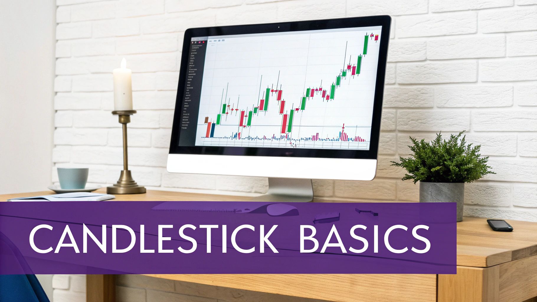
Here's a look at a typical candlestick chart you'd find on a platform like TradingView.
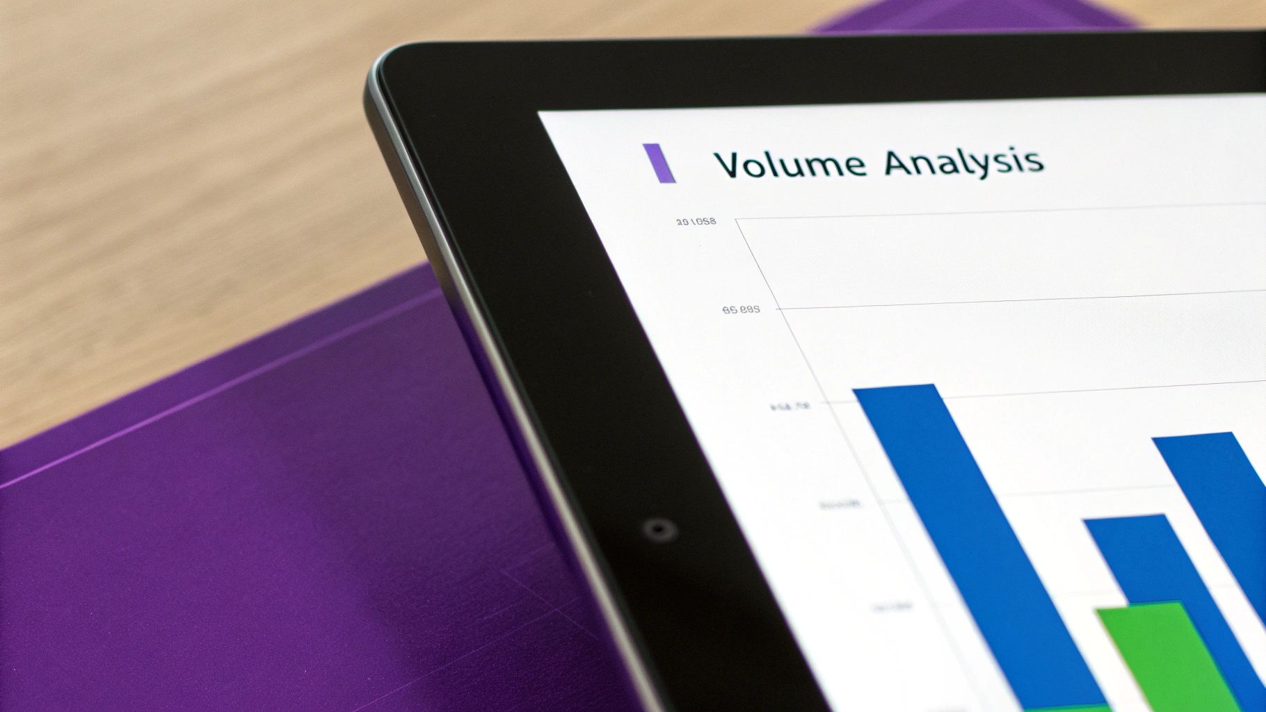
This image gives you a quick visual rundown of market sentiment. You can see the series of green and red candles, with the trading activity (volume) shown in bars at the bottom.
Before we move on, let's put the most important chart components into a quick-reference table.
Core Components of a Cryptocurrency Graph
| Component | What It Tells You | Why It Matters |
|---|---|---|
| Price Axis (Y-Axis) | The current and historical price of the cryptocurrency. | This is the fundamental data point you're tracking. |
| Time Axis (X-Axis) | The timeframe over which the price is being displayed (e.g., minutes, hours, days). | Timeframes change the story; a daily trend can look very different from an hourly one. |
| Candlesticks | The open, high, low, and close prices for a specific time period. | Provides a detailed, at-a-glance summary of price action and sentiment. |
| Volume Bars | The amount of the asset traded during a specific time period. | High volume confirms the strength of a price move; low volume can signal weakness. |
This table covers the absolute basics. Once you're comfortable with these, you can start layering on more advanced indicators.
A classic rookie mistake is just looking at the candle colors. Don’t forget the wicks! Those thin lines extending from the body are crucial. Long wicks often scream market indecision and can be an early warning of a potential trend reversal.
When you start combining these visual clues, you build a story. A string of long green candles on heavy volume paints a much more confident picture than a series of small red candles on weak volume. Getting this foundation right is your first big step. From here, you can dive into more advanced analysis, which we cover in our vTrader Academy for in-depth trading guides.
Reading the Story of Candlesticks and Volume
Every single candlestick on a crypto chart tells a story—a micro-battle between the buyers (bulls) and the sellers (bears) over a set period. Moving beyond the simple "green means up, red means down" is your first real step toward a serious analytical edge. Don't just see them as bars; see them as snapshots of market psychology.
The thick part of the candle, its body, shows the distance between the opening and closing price. A long, solid green body signals that buyers were in aggressive control for the entire session. On the flip side, a long red body tells you sellers dominated from start to finish.
But the real drama is in the thin lines, the wicks (or shadows). These show the absolute highest and lowest prices hit during that period. A long upper wick on a red candle, for example, is a tale of a failed rally—buyers tried to push the price higher but were beaten back down by overwhelming selling pressure.
Common Candlestick Patterns to Watch For
Once you get the hang of reading cryptocurrency graphs, you'll start seeing the same formations pop up again and again. These patterns aren't crystal balls, but they are powerful clues about where the market might be headed next.
Here are a few essential ones to get you started:
- The Hammer: Just like its name, this pattern has a short body and a long lower wick. It usually shows up after a downtrend and suggests buyers are stepping in to "hammer out" a bottom, often hinting at a bullish reversal.
- The Engulfing Pattern: A Bullish Engulfing happens when a big green candle completely swallows the previous, smaller red one. It’s a powerful sign that momentum has swung to the upside. The Bearish Engulfing is the opposite and can flag a potential top.
- The Doji: This candle has almost no body, meaning the open and close prices were nearly identical. A Doji screams indecision. Neither the bulls nor the bears could gain control, and it often appears right before a major trend change.
Volume is the ultimate confirmation tool. A compelling candlestick pattern is one thing, but if it forms on high trading volume, it carries significantly more weight. Think of volume as the amount of conviction behind a price move.
The Crucial Role of Trading Volume
Those bars at the bottom of your chart? That's volume, and it represents the total amount of an asset traded during that candle's period. Ignoring volume is like trying to read a book with half the pages missing. It’s what helps you tell a real trend from a dangerous "fakeout."
Imagine you see a huge green candle break through a key resistance level. If that move happens with a massive spike in volume, it shows intense participation and conviction from buyers. It’s a legitimate breakout.
But what if that same breakout occurs on weak, fizzling volume? That’s a massive red flag. It suggests the move lacks the fuel to keep going and could easily reverse, trapping hopeful buyers.
By learning to read the interplay between candlesticks and volume, you’re no longer just looking at lines on a screen. You're decoding the collective actions of thousands of traders. You can practice spotting these patterns right now on the live Bitcoin price charts available on vTrader.
Identifying Trends, Support, and Resistance
Crypto prices almost never shoot up or down in a straight line. Instead, they ebb and flow in trends, giving us a window into the market's collective mood. An uptrend is pretty easy to spot—it’s just a series of higher peaks and higher valleys (what traders call higher highs and higher lows). This is a clear sign that buyers are in the driver's seat.
On the flip side, a downtrend is a cascade of lower highs and lower lows, which tells you sellers have taken control.
Of course, sometimes the market just can't make up its mind. When the price bounces between a clear high and low without going anywhere specific, that’s a ranging market. In this scenario, neither buyers nor sellers have the upper hand. The easiest way to get a feel for these movements is by drawing trendlines right on your chart.
- For an uptrend, you’ll want to draw a line connecting at least two of the major bottoms (swing lows). As long as the price action stays above this line, the bullish trend is likely still in play.
- For a downtrend, do the opposite: connect two or more of the major tops (swing highs). If the price stays below it, the bears are still in charge.
These lines aren't just for showing direction; they often become dynamic levels of support or resistance themselves.
Finding Your Price Floors and Ceilings
This brings us to two of the most critical ideas in trading: support and resistance. The simplest way to think about them is as invisible floors and ceilings on your chart—areas where the price has historically had a tough time breaking through.
Support is a price level where a downtrend tends to run out of steam, usually because there's a cluster of buyers waiting. It's a "floor" where people have previously jumped in, thinking the asset is a good deal. When the price drops to a support level, it's a zone to watch for a potential rebound.
Resistance is the ceiling. It’s where an uptrend often stalls or reverses entirely. This level is usually stacked with sell orders from traders looking to cash in their profits or from sellers who believe the price has gotten too high.
A rookie mistake is to view support and resistance as razor-thin lines. The reality is they're more like zones. Price can, and often does, dip slightly below a support level or poke just above resistance before snapping back. It's smart to give these areas some breathing room.
To pinpoint these levels, just scroll back on your chart and look for prices where the market has reversed multiple times. The more times a level is tested and holds, the stronger it's considered to be. If Bitcoin, for example, repeatedly bounces off the $60,000 mark, that area solidifies into a major support zone.
Getting a handle on these psychological barriers is a massive step forward in reading crypto charts. It helps you anticipate where the market might have its next big reaction.
Using Technical Indicators to Gain an Edge
Once you get the hang of spotting trends and key levels, it's time to bring in the heavy hitters: technical indicators. These are just mathematical calculations based on a crypto's price and volume. Don't think of them as crystal balls—they're more like specialized tools that help confirm what you're already seeing and give you an extra layer of confidence.
These tools are fantastic for cutting through the market "noise." They give you a much clearer picture of things like momentum, volatility, and potential trend reversals. Instead of overwhelming you with dozens of complex options, let's just focus on two of the most reliable indicators you can start using on any chart, right now.
Smoothing Price Action with Moving Averages
One of the first tools every trader learns is the Moving Average (MA). Its main job is simple: to smooth out the chaotic price swings so you can see the underlying trend more clearly. It works by calculating the average price of an asset over a set number of periods.
There are two MAs that pretty much everyone in the market watches:
- The 50-day Moving Average: This is your go-to for figuring out the medium-term trend.
- The 200-day Moving Average: Think of this as the long-term trend line. It's a major line in the sand for big-money institutional investors.
As a rule of thumb, when a crypto is trading above these moving averages, things are looking bullish. If the price drops below them, it’s a sign that bearish momentum is taking over. Keep an eye out for the "Golden Cross"—that's when the 50-day MA crosses above the 200-day MA, and it's a classic signal for a long-term bull run.
Gauging Market Momentum with the RSI
Now, let's talk about momentum. For that, we turn to the Relative Strength Index (RSI). This is an oscillator that measures the speed and strength of price movements, moving on a scale from 0 to 100. Its primary use is to flag overbought or oversold conditions.
- An RSI reading above 70 suggests an asset is getting overbought and might be due for a pullback.
- An RSI reading below 30 indicates it could be oversold and primed for a bounce.
Here's a tip from my own experience: never act on an RSI signal alone. For instance, if you see Ethereum looking overbought with an RSI of 75, don't just jump to sell. Look for other bearish signs on the chart. Is it also bumping up against a major resistance level? Is the volume starting to fade? When you see a combination of signals, that's a much stronger reason to consider a trade.
The real power here comes from blending these indicators with your understanding of the chart's price action. As crypto adoption grows, these technical tools become even more valuable. By 2025, the global crypto user base was projected to hit around 963 million, which is an 11.82% global penetration rate. More people in the market means more data, making these indicators even more reliable.
Ultimately, mastering indicators is all about building a case. You're looking for multiple signs pointing in the same direction. A great way to get a feel for this is to practice on live charts, like the real-time Ethereum price data available on vTrader.
A Practical Walkthrough of Chart Analysis
Theory is great, but getting your hands dirty is where the real learning happens in crypto trading. Let’s walk through a historical chart together, just like a seasoned trader would, and see how all these concepts—trends, levels, candlesticks, and indicators—actually come together to paint a clear picture.
Imagine we’re looking at a daily chart for a popular coin. For weeks, the price has been grinding upwards. The very first thing we do? Confirm what we're seeing. This is a clear uptrend. Simple.
Next, we zoom out a bit. We're hunting for those major support and resistance zones. Think of these as the historical floors and ceilings where the market has previously paused, reversed, or bounced. Pinpointing these levels is a foundational step before you do anything else.
This graphic breaks down a simple way to find those critical zones.
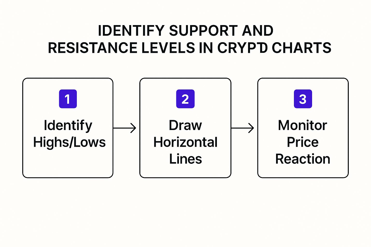
As you can see, it's a straightforward process: spot the major peaks and troughs, draw your lines, and then pay close attention when the price gets near those areas again.
Combining Price Action with Indicators
Okay, so in our scenario, the price is now pushing up against a major resistance level we just marked. This is where things get interesting. We’re not just staring at the price; we’re looking for clues.
You start to notice the candles are changing. They're getting smaller, and many have long upper wicks. This is a classic sign that the buyers are running out of gas and sellers are starting to step in and push the price back down.
At the same time, you take a peek at your trusty indicators.
- Relative Strength Index (RSI): It’s screaming a reading above 70. This is a flashing red light that the asset might be overbought.
- Trading Volume: Those big green volume bars that powered the uptrend? They’re shrinking. As the price struggles at resistance, the buying conviction is clearly fading.
When you put it all together—price hitting a known ceiling, weak candlestick patterns, an overbought RSI, and dropping volume—you have a powerful case for a potential reversal or at least a significant pullback.
This confluence of signals is what traders live for. A single indicator can easily fool you, but when multiple independent signs all point to the same conclusion, your confidence in the analysis skyrockets. It's less about a magic formula and more about building a strong, evidence-based argument.
Making Sense of the Bigger Picture
It’s also smart to zoom out beyond your single chart. Looking at the total cryptocurrency market capitalization gives you a feel for the overall health of the market. For instance, the global market cap hit nearly $3.91 trillion in early 2025—a massive 97.81% jump from the year before. Seeing that kind of growth tells you the macro trend is strong. You can dig into more of this kind of data on Statista.
By layering your on-chart analysis with these bigger-picture trends, you get a much more robust view. Whether you're analyzing a major like Bitcoin or a stablecoin like the one you can explore on vTrader’s USDC page, the process stays the same. You find the trend, mark your levels, read the price action, and use indicators to confirm what you’re seeing. That layered approach is the key to reading crypto charts like a pro.
Common Questions About Reading Crypto Charts
As you start getting your hands dirty with crypto charts, you’ll inevitably run into the same questions that trip up every new trader. It's one thing to understand the theory, but it’s a whole different ball game when you're staring at a live chart blinking back at you.
Let's break down some of the most common sticking points to help you move forward with more confidence.
What’s The Right Timeframe To Use?
One of the first puzzles to solve is which timeframe to watch. Should you be on a 1-hour, 4-hour, or daily chart? The honest answer is: it completely depends on your strategy. There's no magic bullet here.
- Day traders live on the shorter timeframes. They're often glued to the 5-minute or 15-minute charts, looking to jump in and out of trades based on small, quick price movements.
- Swing traders, who might hold a position for a few days or even weeks, find their sweet spot on the 4-hour and daily charts. These give a clearer picture of the medium-term trends they're trying to ride.
- Long-term investors zoom way out. They're looking at the weekly or monthly charts to get a bird's-eye view of the major market cycles and direction.
The crucial thing is to match the chart to your trading horizon. A classic rookie mistake is making a long-term investment decision based on a hiccup on the 5-minute chart. That’s a fast track to panic-selling at the first minor dip.
How Many Indicators Should I Clutter My Chart With?
Another rabbit hole is the world of technical indicators. With literally hundreds to choose from, it’s incredibly easy to fall into the trap of "analysis paralysis." You’ve probably seen those charts that look like a toddler went wild with a crayon box—ten different indicators all flashing conflicting signals. That’s more noise than signal.
Most seasoned traders I know keep their charts clean and simple. A solid starting point is to pick just 2-3 indicators that work well together, each telling a different part of the story.
For instance, a great combo is:
- Moving Averages to get a handle on the overall trend direction.
- RSI (Relative Strength Index) to measure momentum and see if an asset is getting overbought or oversold.
- Volume to confirm whether there's real conviction behind a price move.
This setup gives you a solid read on trend, momentum, and strength without turning your screen into a Jackson Pollock painting.
The goal isn’t to find a secret recipe of indicators that predicts the future. Think of them as confirmation tools. They should support the story that the price action, along with support and resistance levels, is already telling you.
What Is The Most Important Thing To Learn First?
If you're just starting out and feeling overwhelmed, nail down the absolute fundamentals before you touch anything else: trend, support, and resistance. Seriously. These three concepts are the bedrock of technical analysis because they reflect raw market psychology.
Learning to identify if the market is trending up, down, or just chopping sideways—and pinpointing the key levels where buyers and sellers are likely to step in—will give you 80% of the insight you need to make better decisions.
Candlestick patterns and fancy indicators are powerful, no doubt. But they only really shine when you use them within the context of the market's core structure. Master the basics first, and all the other tools will suddenly make a lot more sense.
And if you have more specific questions, you can always check out a detailed crypto trading FAQ to deepen your understanding.

Steve Gregory is a lawyer in the United States who specializes in licensing for cryptocurrency companies and products. Steve began his career as an attorney in 2015 but made the switch to working in cryptocurrency full time shortly after joining the original team at Gemini Trust Company, an early cryptocurrency exchange based in New York City. Steve then joined CEX.io and was able to launch their regulated US-based cryptocurrency. Steve then went on to become the CEO at currency.com when he ran for four years and was able to lead currency.com to being fully acquired in 2025.