Learning to read a crypto chart is all about turning that mess of visual data into something you can actually use. It really boils down to a few key things: getting a feel for candlestick patterns, spotting where the price finds a floor (support) or a ceiling (resistance), and using trading volume to double-check what you’re seeing.
Once you get these core pieces down, you'll start to see the market's mood and make much smarter decisions.
Your First Look at a Crypto Chart
Jumping into a crypto chart for the first time can be a shock to the system. It looks like a secret code, and it's easy to feel overwhelmed.
But here’s the thing: it’s way simpler than it looks. A chart is just a collection of small, individual stories that, when pieced together, tell you the bigger market narrative.
The most fundamental building block of any chart is the candlestick. Think of each one as a snapshot of the constant tug-of-war between buyers (the bulls) and sellers (the bears) over a set period—whether that's a minute, an hour, or a full day.
These candlestick charts have been the gold standard for traders since they were invented by Japanese rice merchants way back in the 18th century. They're not just for crypto; you'll see them in forex and stock markets, too. Each candle gives you four critical data points at a glance: the open, high, low, and closing price for its timeframe.
The Anatomy of a Candlestick
To really get started, you have to understand what each part of a single candle is telling you. This is the foundation for everything else.
Let's break down the essential components.
| Component | What It Tells You | Visual Cue |
|---|---|---|
| The Body | Shows the price difference between the open and close. A long body signals strong momentum. | The thick, rectangular part of the candle. |
| The Wicks | Represents the highest and lowest prices reached during the period. Long wicks suggest volatility. | The thin lines sticking out from the top and bottom of the body. |
| The Color | A quick visual cue for price direction. | Green = price closed higher (bullish). Red = price closed lower (bearish). |
Getting comfortable with these three elements will transform how you see a chart. You'll quickly move from seeing noise to spotting potential signals.
Understanding Volume Bars
Look below the main price action on almost any chart, and you'll see a series of vertical bars. These are the volume bars, and they are one of the most powerful—and most ignored—tools at your disposal.
Each bar shows you exactly how much of an asset was traded during the same timeframe as the candlestick directly above it. Why does that matter? It's all about confirmation.
A big price move on high volume tells you there’s real conviction behind it, making the signal more reliable. But a breakout on weak volume? That could be a classic fakeout—a trap that catches new traders all the time.
When you combine the story of a candlestick with its corresponding volume, you get a much richer picture. A long green candle on massive volume is a powerful confirmation of bullish strength. On the flip side, a long red candle with a huge volume spike signals intense selling pressure.
Mastering these basics is your first real step toward becoming a proficient chart reader. If you want to go deeper into technical analysis concepts, the resources at the vTrader Academy are a great next stop.
Decoding Common Candlestick Patterns
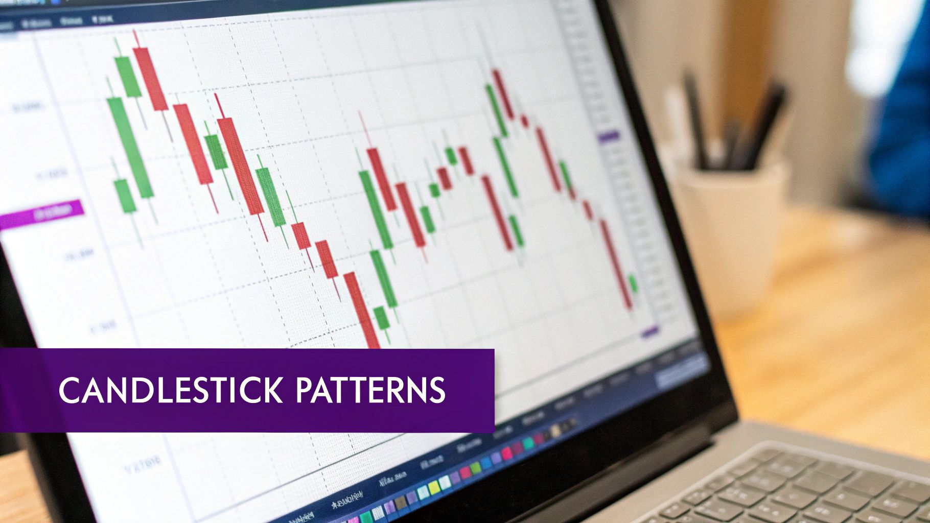
Once you’ve got a handle on reading a single candlestick, the real magic begins when you start to see how they interact. Think of it like a conversation. Groups of candlesticks form patterns that tell a vivid story about market psychology, giving you powerful clues about where the price might be heading.
These patterns aren't just random shapes on a screen; they are the visual footprints of the constant battle raging between buyers and sellers. Learning to spot these formations is what elevates you from just watching the market to actually analyzing it. You start anticipating moves instead of just reacting after the fact.
Bullish Reversal Patterns
Bullish reversal patterns are your signal that a downtrend might be running out of steam. They often pop up at the bottom of a slump, hinting that the sellers are getting tired and the buyers are starting to muscle their way in. Spotting one early can be a game-changer.
Two classic patterns you'll see time and again are the Hammer and the Bullish Engulfing pattern.
-
The Hammer: This one looks exactly like its name. It’s got a small body up top with a long wick hanging down. This tells you that sellers gave it their best shot to push the price lower, but buyers charged in and drove it right back up near where it opened. When you see this after a long price drop, it’s a strong sign the market could be bottoming out.
-
Bullish Engulfing: This is a two-candle combo. First, you have a small red (bearish) candle. Then, it's completely swallowed up or "engulfed" by a much larger green (bullish) candle. This is a dramatic power shift, showing that buyers didn't just show up—they took over with force. It often signals a strong potential reversal to the upside.
Bearish Reversal Patterns
On the flip side, bearish reversal patterns tend to show up at the peak of an uptrend. They're a warning that the buying frenzy is fading and sellers are starting to take control, which could lead to a price drop.
A perfect example is the Bearish Engulfing pattern, which is the mirror opposite of its bullish cousin. It kicks off with a small green candle that gets completely dwarfed by a huge red candle right after it. This formation shows a massive change in sentiment where sellers have seized control, often right before a downward slide.
Remember, context is everything. A bearish pattern is far more significant if it appears at a known resistance level, just as a bullish pattern carries more weight when it forms at a support level.
Patterns of Indecision
Not every pattern screams "buy" or "sell." Some just tell you the market is taking a breather and trying to figure out its next move. The most famous of these is the Doji.
A Doji candle has a tiny body because its open and close prices are nearly identical, making it look like a cross or a plus sign. This formation means that neither the buyers nor the sellers could gain an edge, resulting in a stalemate. While a Doji itself is neutral, seeing one after a big run-up or sell-off can be a warning that momentum is stalling. Think of it as the market catching its breath before making a decision.
By recognizing these key patterns, you add another powerful layer to your chart-reading skills, helping you get a much better feel for market sentiment and make smarter, more strategic trades.
Identifying Support Resistance and Trend Lines
Ever found yourself watching a crypto chart, completely mystified as to why the price slams into an invisible ceiling and tumbles, or hits a solid floor and bounces right back up? It’s not magic. What you're witnessing are the core principles of support and resistance at play.
These price zones are really the bread and butter of technical analysis. They mark out historical battlegrounds where the tug-of-war between buyers and sellers hit a fever pitch. If you want to learn how to read crypto charts like a pro, getting a handle on these is non-negotiable.
-
Support is that price floor where buyers have historically stepped in with enough force to overwhelm sellers, either pausing a downtrend or reversing it entirely.
-
Resistance is the price ceiling where sellers tend to take control, halting a rally in its tracks as buying interest dries up.
Think of these levels as psychological lines in the sand. When a crypto repeatedly fails to break above a certain price, that level becomes a widely recognized resistance zone. Many traders will instinctively place sell orders there, which only reinforces its strength.
Drawing Your Key Levels
Finding these levels is more art than science, but it’s straightforward. To spot support, just look for previous swing lows where the price turned around. For resistance, you’ll want to identify the previous swing highs where the rally got snuffed out. Once you have them, draw horizontal lines connecting these points on your chart.
The more times the price tests one of these levels, the more significant it becomes. Here’s a powerful trick: a level that once acted as tough resistance can often flip to become solid support after a decisive breakout. This "role reversal" is a classic pattern you'll see time and time again.
Support and resistance lines on charts are critical in a volatile market. These horizontal levels indicate price points where buying or selling forces intensify, guiding traders on when to cautiously enter or exit positions.
Just look at the total crypto market cap. It saw a massive surge to over $3 trillion in late 2021 before crashing below $1 trillion in 2022 and then clawing its way back. Throughout that entire rollercoaster, key levels consistently acted as major pivot points. You can dig through historical data on CoinMarketCap to see these levels in action for yourself.
Visualizing Market Direction with Trend Lines
While support and resistance give you the horizontal picture, trend lines add the diagonal dimension, helping you visualize the market’s broader direction.
An uptrend line is drawn by connecting at least two significant swing lows. As long as the price action respects this line and stays above it, you can feel confident the bullish trend is still running.
On the flip side, a downtrend line connects the swing highs. A clean break above this line is often the first real sign that the bears are losing their grip and a reversal might be on the cards.
Mastering these simple lines is a huge leap forward. It gives you a framework for understanding the market, letting you set more logical profit targets near resistance and place smarter stop-losses just below key support or a rising trend line.
Using Technical Indicators for Deeper Insights
If candlestick patterns tell you what the price is doing right now, technical indicators are your secret weapon for understanding why it's happening—and where it might go next. These aren't magic crystal balls. They're mathematical tools that cut through the noise of price and volume data to give you a real edge.
Trying to trade based on raw price action alone can feel like navigating in the fog. Indicators add that extra layer of context, helping you confirm patterns you see, feel out the market's momentum, and spot potential reversals before they're obvious to everyone else.
Let's skip the overwhelming list of hundreds of indicators and focus on three battle-tested tools that form the foundation of any solid trading strategy.
Essential Technical Indicators for Beginners
To get you started, here’s a quick rundown of three of the most popular and effective indicators you'll find on any charting platform. They each measure something different, giving you a more complete picture when used together.
| Indicator Name | What It Measures | Key Signal to Watch |
|---|---|---|
| Moving Averages (MA) | The average price over a set period, smoothing out volatility to show the underlying trend direction. | When price is consistently above the MA, it's generally bullish. When it's below, it's bearish. Watch for MA crossovers. |
| Relative Strength Index (RSI) | The speed and magnitude of recent price changes to identify overbought or oversold conditions. | A reading above 70 suggests the asset is overbought; below 30 suggests it's oversold and may be due for a bounce. |
| Bollinger Bands | Market volatility by creating a dynamic price channel with upper and lower bands around a moving average. | When bands "squeeze" or tighten, it often signals a big price move is coming. Price touching the outer bands indicates relative highs or lows. |
These three work beautifully together. You can use Moving Averages to get your bearings on the main trend, RSI to gauge if the current move is running out of steam, and Bollinger Bands to see if the market is quiet or about to explode.
Moving Averages: The Trend Followers
One of the first tools every trader learns is the Moving Average (MA), and for good reason. It’s brilliant at smoothing out the chaotic, day-to-day price action to reveal the true underlying trend. It's simple: the MA line on your chart just plots the average closing price over a certain number of days, like 50 or 200.
- When the current price is trading above its moving average, the trend is generally considered bullish. Buyers are in control.
- Conversely, if the price dips below its moving average, it's a sign that sellers are taking over and the trend could be turning bearish.
A classic signal that gets traders excited is the "golden cross." This happens when a shorter-term MA (like the 50-day) crosses above a longer-term one (like the 200-day). It's a powerful sign that bullish momentum is building and could signal the start of a major uptrend. For more historical data on trend signals, resources like CoinDesk can be invaluable.
The Relative Strength Index: Gauging Momentum
Ever wonder if a rally has gone too far, too fast? That's where the Relative Strength Index (RSI) comes in. It's a momentum oscillator that measures the speed and change of price moves, plotting the result on a scale from 0 to 100. Its main job is to flag when an asset might be overbought or oversold.
Think of it this way: an RSI reading climbing above 70 is a warning that the market might be getting a bit too greedy and could be due for a pullback. On the flip side, an RSI dipping below 30 suggests the selling might be overdone, and the asset could be ripe for a bounce.
Pro Tip: An RSI reading in overbought or oversold territory isn't a direct command to buy or sell. It’s a heads-up. For instance, if you spot a bearish engulfing pattern on your chart right as the RSI ticks above 70, that's a much stronger signal that a reversal is coming.
Bollinger Bands: Measuring Volatility
Created by the legendary John Bollinger, Bollinger Bands are a fantastic tool for visualizing market volatility. They consist of three lines: a simple moving average in the middle, flanked by an upper and lower band that are typically two standard deviations away.
When the market gets choppy and volatile, the bands expand. When things quiet down, they contract.
This gives you a dynamic channel that helps identify relative highs and lows. Price hitting the upper band is considered expensive, while a touch of the lower band is considered cheap. Watch out for a "squeeze"—when the bands narrow dramatically. This is often the calm before the storm and can precede a massive price breakout.
A Practical Checklist for Analyzing Any Chart
Knowing the individual pieces of a crypto chart is one thing, but actually putting them together to make a confident trade is a whole different ball game. What you need is a systematic process—a repeatable checklist—that lets you analyze any chart the same way, every single time. This is how you take emotion out of the equation and focus only on what the data is telling you.
This structured approach keeps you from reacting to every little price wiggle and instead helps you build a complete analytical picture from the top down. Think of it as your best defense against impulse trades and the dreaded analysis paralysis.
Start with the Big Picture
Before you even dream of hitting the buy button, you have to know which way the river is flowing. That means zooming out. Pull up a higher timeframe chart, like the daily or weekly, and figure out the market's primary direction. Is the price making a series of higher highs and higher lows? That’s an uptrend. Or is it grinding its way down? That’s a downtrend.
This high-level view gives you the context you can't trade without. Trying to force a short-term bullish trade in the middle of a brutal downtrend is like swimming against a riptide. Sure, it’s possible, but why make it so hard on yourself? Always try to align your strategy with the dominant market trend.
Map Out Your Key Battlegrounds
Once you’ve got the main trend locked in, it’s time to mark up your chart with key levels of support and resistance. These are the horizontal price zones where the market has flipped direction in the past. Look for areas where the price has touched multiple times—these are the psychological lines in the sand for buyers and sellers.
This simple, three-step method shown below is a great way to identify and use these critical price levels.
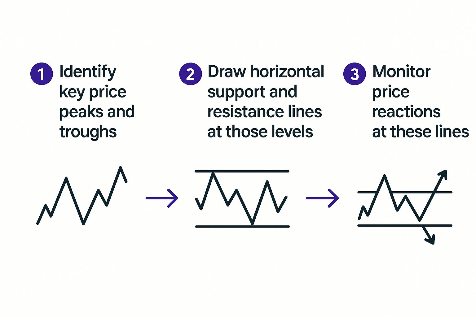
This process really helps you visualize where to expect the action to happen, which makes planning your entries and exits a heck of a lot easier.
Hunt for Confirmation Signals
Now for the fun part. As the price gets close to one of your key levels, zoom into a lower timeframe (like the 4-hour chart) and start hunting for confirmation. This is where your knowledge of candlestick patterns and technical indicators really pays off.
- Candlestick Patterns: Do you see a bullish engulfing pattern or a hammer forming right on a support level? That could be a powerful sign of an impending bounce.
- Technical Indicators: Is the RSI dipping into oversold territory just as the price kisses your support line? Maybe a key moving average is lining up with that same level, adding another layer of strength.
The most powerful trade setups happen when multiple signals all point to the same conclusion. A bullish candlestick pattern at a major support level, confirmed by an oversold RSI and a spike in volume, is a much higher-probability trade than any one of those signals by itself.
This final step is all about building a solid case for your trade. The more pieces of evidence you can stack in your favor, the better your odds of success. This systematic process is the absolute core of learning how to read crypto charts like a pro.
Frequently Asked Questions
Once you dive in and start applying this stuff, you're bound to have questions. It’s one thing to understand the theory, but it's another to use it in the heat of the moment. Let's walk through some of the most common questions that pop up for new traders.
What Timeframe Is Best for Reading Crypto Charts?
This is the classic "it depends" question. There's no magic timeframe that works for everyone; the right one is completely tied to your trading strategy.
- Day traders, who are in and out of positions within hours, often stick to the 5-minute or 15-minute charts. They're looking for quick, small moves.
- Swing traders holding for a few days or weeks usually prefer the 4-hour or daily charts. These give a much clearer picture of the broader trend.
- Long-term investors might only check the weekly charts to get a high-level view of the market's direction without getting lost in the day-to-day noise.
A great way to start is by using multiple timeframes. Get your bearings on the daily chart to see the big picture trend, then zoom into the 4-hour chart to find a solid entry or exit point. This keeps you from fighting the market’s overall momentum.
How Reliable Are Candlestick Patterns?
Think of candlestick patterns as strong suggestions, not ironclad guarantees. They are fantastic for reading the psychology of the market at a glance, but they aren't a crystal ball.
Their real power comes alive when you get confirmation from other signals. A bullish engulfing pattern is interesting on its own, but it becomes a high-quality setup when it forms at a major support level and you see a big spike in trading volume. Never trade a pattern in isolation.
The pros use patterns as just one piece of the puzzle. They hint at what could happen, but it’s the confirmation from other tools that turns a possibility into a trade worth taking.
Can I Practice Chart Reading Without Risking Money?
Yes, and you absolutely should. Jumping in with real money before you're ready is one of the fastest ways to lose it. Most crypto exchanges and specialized platforms like TradingView offer paper trading or demo accounts.
These are essentially trading simulators. You get to play with live market data and make trades with fake money, giving you a completely risk-free environment to hone your skills. You can test strategies, learn the platform, and build confidence. I'd recommend spending at least a few weeks in a demo account until you feel you have a solid grasp of your strategy. For any other questions, the vTrader FAQ page has you covered.
Ready to put your chart reading skills to the test in a real-world environment? Join vTrader today to enjoy commission-free trading, advanced charting tools, and a seamless experience on any device. Sign up now and start your trading journey with a platform built for success at https://www.vtrader.io.

Steve Gregory is a lawyer in the United States who specializes in licensing for cryptocurrency companies and products. Steve began his career as an attorney in 2015 but made the switch to working in cryptocurrency full time shortly after joining the original team at Gemini Trust Company, an early cryptocurrency exchange based in New York City. Steve then joined CEX.io and was able to launch their regulated US-based cryptocurrency. Steve then went on to become the CEO at currency.com when he ran for four years and was able to lead currency.com to being fully acquired in 2025.
